Maxfield Parrish– Aquamarine
It is generally admitted that the most beautiful qualities of a color are in its transparent state, applied over a white ground with the light shining through the color.
–Maxfield Parrish
I am currently preparing a small group of work for my Gallery Talk at the Principle Gallery on Saturday, September 28. Part of my prep work for the talk is also trying to think through things I might speak about. One question that often arises is what artists I view as influences. I usually respond with a quick list but often forget to mention Maxfield Parrish.
I came across the quote above recently and I realized that the very thought he expressed about the beauty of transparent color on a white ground was the basis for almost all my early work. I painted then (and sometimes now) with watercolors and transparent inks on a white gessoed surface. It give a glow to the colors that imbues everything with light.
This thought reminded me of meeting someone who had seen my 2012 show at the Fenimore Art Museum who said that he was attracted to my work because they were the paintings he wanted to paint. That’s advice I often offer to would-be painters and, looking at the work of Maxfield Parrish, I can see myself now in his shoes. Below is a reposting of a blog entry from January of 2009 that I think really summarizes what I see in his work and how I have incorporated some of these things into my own. I have also added a video slideshow at the bottom of this page containing Parrish’s best-known pieces.
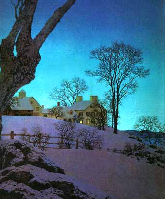
Christmas Morning 1949– Maxfield Parrish
Today I want to just show the influence of Maxfield Parrish on my work. He is certainly well known for his fairy tale-like scenes of scantily-clad young women or children in fantastical settings but I have always loved his other, lesser known work, particularly his landscapes and homescapes.
There’s an intensity and warmth of color that I find completely compelling, drawing you in immediately and immersing you in a luxurious blanket of warm tones. For instance, in the piece above, Christmas Morning 1949, even though it is a wintry, snowy scene there are warm tones in the snow fields. It changes how you look at and feel about the scene, differentiating it from the normal, obvious winter landscape.
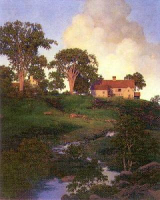
Hunt Farm- Maxfield Parrish
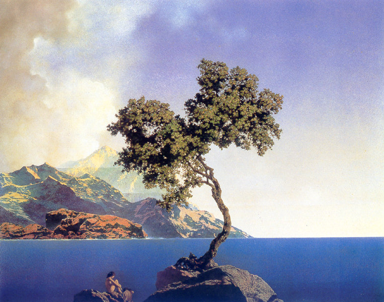
I am also visually excited by the way Parrish used gradience in the colors of his skies, taking a deep rich color at top and drawing it down in lighter fragments of the colors that make up the original color. It creates a brilliant effect.
The trees often took a central part in his compositions as well, something to which I was obviously attracted. Many were boldly colored and powerful.
The houses were mainly long range and very idyllic, warm interpretations. More home than house. There was never a specific story conveyed in these homes, just an overall feeling that was formed by their part in the overall picture. 
I have also been influenced by the way Parrish put his compositions together, how all the elements were placed to create mood. The way the trees fill the picture plane. The way the houses are shown, seldom in full view. More about feeling and inference rather than representation.
I could go on and on about his work and all the little things comprising his magic that I’ve tried to incorporate into my own work but the images tell the story much better. Enjoy…


