Feeds:
Posts
Comments

Posts Tagged ‘Louis Comfort Tiffany’

John LaFarge- Samoan Dancing a Standing Siva 1909I am a big fan of stained glass windows.  It has influenced my work in many ways, from trying to emulate the brilliance and glow of the colors to the way in which I see and compose my work.  I have been lucky enough to live in an area with access to the work of Louis Comfort Tiffany who is easily the best known and most stylish of stained glass makers.  The Corning Museum of Glass has a number of his pieces, which are remarkable,  as do several churches in the area.

But there is someone to rival, if not eclipse, the works of Tiffany, someone who actually paved the way for Tiffany’s work with his innovative work in stained glass.  This was John LaFarge.  I can’t remember the exact piece or location of the first time I saw his work except that it was somewhere in NYC.  But I do remember the stunning colors and the lead work which held the glass pieces together.  It  was so different than that of other stained glass windows I had seen which was normally clean and neat, fitting for the solemnity of a church.  But the LaFarge lead work I saw was rough and dark, dividing the opalescent glass but also becoming part of the composition in itself.  His lines were organic and integral to the composition.  It was remarkable.

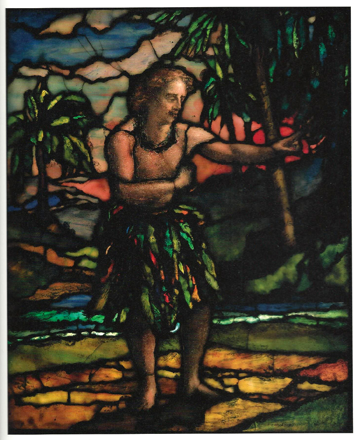
I came across the image shown above recently,  Samoan Dancing a Standing Siva, in a book about LaFarge’s travels to Tahiti and other South Pacific islands in the early 1890’s and about how this expedition changed his work.  It’s interesting that the other artist whose work was transformed by Tahiti, Paul Gauguin, arrived on the island just days after LaFarge departed.

This piece of stained glass excites me very much in the use of line, especially in the naturalness and organic feel of them, as well as the contrast between the brilliance of the colors and the the darknesses that surround them.  To me,this is simply magnificent, possessing those things that I want to see in my own work.

There is a Pinterest page with many of LaFarge’s more famous stained glass pieces, most of which are a bit more formal than this piece above.  But it gives a nice overview of his work on one page.  To see it click here.

Read Full Post »

 In a post from a few days ago and several times before, I have mentioned the stained glass windows that came from the studio of Louis Comfort Tiffany in the early part of the 20th century.  They have been a large influence on my work over the years, from their use of complex color harmonies to the way they are composed using simplified forms and strong lines which divide and define the panels.  I never try to imitate any one piece or even have them in mind when working, but I often find myself comparing my work, after it is completed, to them as far as color and composition are concerned.  Often, the paintings that satisfy me the most have an opalescent quality in their color with each color having elements of several colors combining to create a depth of harrmony in the piece, if done well enough.

The panel shown here is a good example.  It is a panel of magnolias that resides at the First Unitarian Congregational Church in Brooklyn, NY.  This is a little darker and contrasted than the image of this window that the church uses on an available  notecard but , for our purposes, this works well.  It shows distinctly the many colors that make up the distant sky– the multiple blues, yellows and pinks which combine masterfully.  In other hands, such a melange could come off as shrill and sharp.  Even cheesy.  But here it has a glowing harmony.

The beautiful silhouettes of the magnolias that cut the sky are graceful  and delicate yet powerful as they climb across the ocean of color behind.  The whites of the flowers are multi-colored with only hints of actual white.  The landscape that runs to the distanet has greens and blues and purples running through them as they provide a deep counterpoint that only enhances the depth of the sky.

Just beautiful.

So, when I mention the windows of Tiffany, you’ll hopefully have a better idea of what I mean.  We’re very lucky that Tiffany Studios was tremendously prolific and that many of these windows still are preserved for our viewing pleasure.  I am always enthralled when I come across one and never turn away feeling less than inspired.  It is that feeling that I hope most carries through in my own work.

Read Full Post »

In the past year or so,  I have done a series of paintings where I took out much of the color in my work, leaving behind sometimes monochromatic renderings of my compositions.  But recently I have swung back to the deeper, richer colors that has long marked my work.  I think this new painting is a good example of this return to color.

I call this piece Discovery’s Door and it’s a 15″ by 25″ painting on paper.  The Red Tree here is again the central figure and holds a position that feels like it is in a spotlight as its image emerges into sight from behind the darker trees that frame it.  It’s this emergence that gives me the discovery in the title as well as the bright light that seems to be illuminating the tree.  A light of epiphany, self-discovery.

The colors here are very strong but there is a harmony between them that makes their impact seem softer and natural.  I don’t think this will come through in this image on a computer screen but the blues and greens of the sky and the water have an opalescence that brings to mind a favorite color of mine from the windows of Louis Comfort Tiffany.  It gives this piece  a bit of the feel of a stained glass panel, something I often hear from people who see my work for the first time.  I definitely see that here.

I also think the intensity of the color here enhances the sense of self-discovery implied in the title.  As though the realization of one’s true self suddenly makes everything near seem more vivid and alive, forcing their way into the memory of the moment, creating a sensory marker. I know that I often remember major moments of my own life either  in deep colors or in strong scents.  That is what I see here in this image of a moment of self-realization– the vividness of the moment.

Read Full Post »

%d bloggers like this: