Feeds:
Posts
Comments

Posts Tagged ‘Vincent Van Gogh’

Van Gogh The Bedroom detail from Google ArtAs though I have been searching for more ways to kill time, I have spent well over an hour already this morning just clicking on images on what might be my new favorite website, the Art Project at the  Google Cultural Institute.  It’s a collection of great paintings and objects of art from around the world, all photographed in stunning detail that allows you to get closer, in many cases, than you could ever get at any museum.  Some are photographed in a Gigapixel  mode that allows you to be almost part of the surface.

Van Gogh The Bedroom  from Google ArtFor example, one of the first images I came across was The Bedroom  from Vincent Van Gogh, a favorite of mine shown here on the left in its entirety.  Whenever I see a Van Gogh in person I always want to get as close as I can to  see the fervid brushstrokes that give the pieces so much life and energy.  I have been asked to step away from the paintings in the past but with this site can now zoom in to a level that my eyes (and security guards) would never allow in a museum.

Van Gogh The Bedroom mid-level detail from Google Art
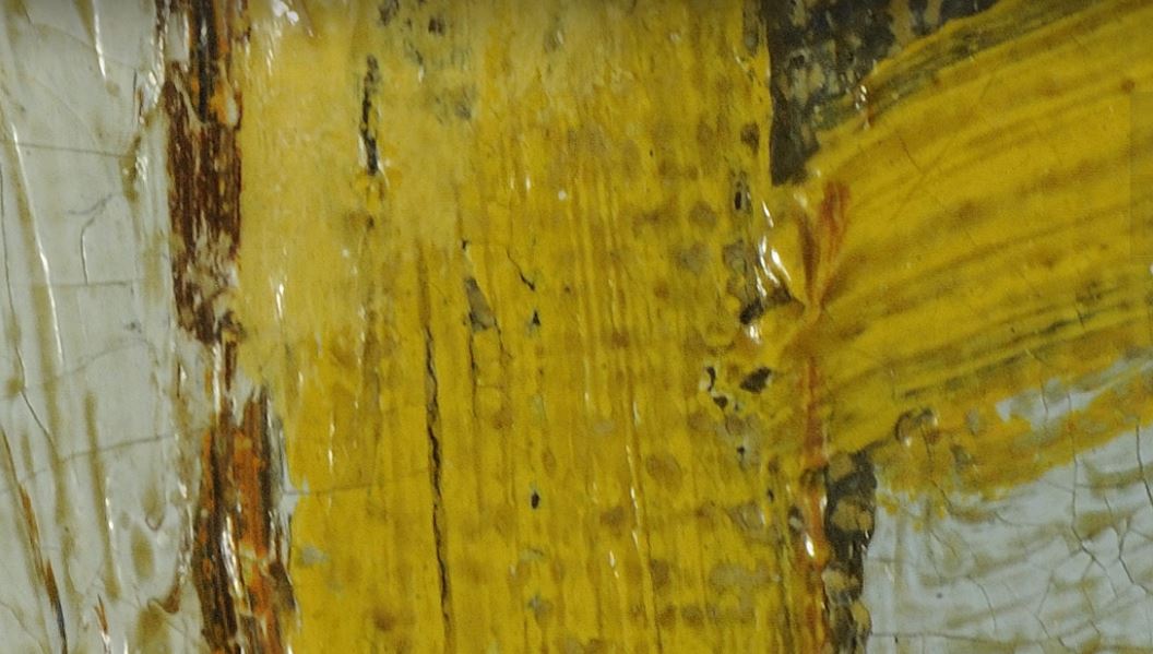
The images here to the  right  and at the top are of one of the rungs of yellow chair’s back in the center of the painting.  The top image is magnified to a high level but there is still another level beyond this to which it can be magnified.  I can see the canvas under the strokes, the varnish’s darkened surface in the crevices and the craquelure (cracking) of the oil paints.  I feel like I am seeing Van Gogh working on the painting, can see how his mind is forming the image on the canvas.  It deepens the whole sensation of the painting for me.

What a great site!  On a local level,  this site features over 1000 items from our own Corning Museum of Glass.  There are incredible views of glass objects from antiquity up to modern art pieces.

Well, I have just a little more time to spend this morning so I better get back to looking at some super details of great art.  Check it out!

Read Full Post »

Howard Pyle-  Marooned PirateLater this year, the Fenimore Art Museum will be presenting a big show featuring the works of the first family of American art, the Wyeths, in a show titled  The Wyeths: A Family Legacy.  I have written several times here about my admiration for the work of  family patriarch NC Wyeth and son, Andrew Wyeth.  Their work is woven into the cloth of American art and this should be a great exhibit highlighting their work as well as other talented members of the clan.  Also included in this show will be work  by the great American illustrator, Howard Pyle, who was the teacher and mentor to NC.

Howard PyleAlthough his name is not nearly as well known as many who followed in his footsteps, it’s hard to overstate the influence that Pyle (1853-1911)  had on future generations of American illustrators and artists.  He was huge in his time, a celebrity who mingled with the great writers and thinkers of the time.  His illustrations for many of the most popular magazines of that time, based on the great stories of literature, shaped how we saw those stories.  Cinematographers, costumers and set designers took their clues from Pyle’s visions of the stories they were staging.  For example, his vision of Robin Hood became the idealized version that we came to know in the old Errol Flynn classic movie.  His idea of the pirates of Treasure Island became ours.  His cowboys, knights  and explorers ingrained themselves into our collective psyche as we saw them on the page and on the movie screen.

Howard-Pyle-The-Wolf-and-Doctor-Wilkinson-Once-it-Chased-Doctor-Wilkinson-into-the-Very-Town-ItselfThere is an interesting sidebar to the extent of Pyle’s fame.  In a letter to his brother, Theo, Vincent Van Gogh wrote ” Do you know an American magazine Harpers Monthly?  There are wonderful sketches in it…which struck me dumb with admiration…by Howard Pyle”  His work may have been illustration but it was  pure art as well and the eye of Van Gogh could see that in the  line work and rhythm of his compositions.   I know that I am always inspired by his work and the that of his acolytes,  including NC Wyeth and Norman Rockwell.   I am  really looking forward to seeing his work alongside the Wyeths this year at the Fenimore.  It should be a memorable show.


Read Full Post »

Painting is a blind man’s profession.  He paints not what he sees, but what he feels, what he tells himself about what he has seen.

–Pablo Picasso

********************

I love this quote.  I think that is what all art really is– an expression of  feeling.  Emotion.  I know my best work, or at least the work that I feel is most directly connected to who I truly am as a human being, is always focused on expressing emotion rather than depicting any one place or person or thing.  At its best, the  piece as a whole becomes a vehicle for expression and the subject is merely a focal point in this expression.  The subject matter becomes irrelevant beyond that.  It could be a the most innocuous object,  a chair or a tree in my case.  It doesn’t  really matter because the painting’s emotion is carried by the painting as a whole-  the colors, the texture, the linework, the brushstrokes, etc.

In other words, it’s not what you see but what you feel.

I think many of  Vincent Van Gogh‘s works are amazing example of this.  They are so filled with emotion that you often don’t even realize how mundane the subject matter really is until you step back to analyze it for a moment.  I’ve described here before what an incredible feeling it was to see one of his paintings  for the first time, how it seemed to vibrate with feeling, seeming almost alive on the wall.  It was a vase of irises.  A few flowers in a pot.  How many hundreds of thousands of such paintings have been created just like that?  But Van Gogh resonates not because of the subject matter, not because of precise depiction of the flowers or the vase.  No, it was a deep expression of his emotion, his wonder at the world he inhabited, inside and out.

I also see this in a lot of music.  It’s not the subject but the way the song is expressed.  How many times have we heard overwrought , schmaltzy ballads that try to create overt emotion and never seem to pull it off?  Then you hear someone interpret a simple song with deep and direct emotion  and the song soars powerfully.  I often use Johnny Cash‘s last recordings, in the last years  and months before his death, as evidence of this.  Many were his  interpretations of well known songs and his voice had, by that time, lost much of the power of his earlier days.  But the emotion, the wonder, in his delivery was palpable.  Moving.

Likewise, here’s Chet Baker from just a few months before his death.  He, too, had lost the power and grace of youth due to a life scarred by the hardship of drug abuse and violence.  But the expression is raw and real.  It makes this interpretation of  Little Girl Blue stand out for me.

Read Full Post »

I was looking through a book of American Expressionist paintings and came across this piece that completely pulled me in.  It was a scene of Greenwich Village in the 1940’s painted in spectacular fashion by Beauford Delaney, a name with which I wasn’t too familiar.  Looking at it, there was so much going on in this quiet street scene that it was like a luscious meal set before me and I simply hovered over it, savoring it  before I dug in.  I didn’t know where to start.

The colors are big and bold with a blue night sky that brought Van Gogh to mind and a moon that hangs in a crescent  that floats almost sweetly over the near empty street.  It is rough and expressionistic yet elegant and complex in the ways the colors play off one another.  It is quiet yet hardly timid.  It is what it is, a street scene, but its abstracted manner gives it other dimensions and depths.

Just about everything I want in a painting.

Like I said, I didn’t know much about Beauford Delaney, to my embarrassment.  He’s shown here in a 1940 portrait done by Georgia O’keefe, which I thought was pretty interesting as well.  Born in 1901 in Knoxville, Tennessee, he and his brother, Joseph, were both prominent artists and part of the Harlem Renaissance of the 1930’s.  Beauford never achieved the sort of recognition here that his work deserved and he struggled mightily until finally leaving the States in the early 1950’s, settling in Paris where he lived the rest of his life, dying in 1979.  There is an interesting short  bio, A Tale of Two Brothers by Jack Neely, online for those who seek to know a bit more about the man.

I know I will be looking for more of his work.


Read Full Post »

Scene from Black Narcissus

As an artist, I am of course influenced by color in many things.  Obviously, the colors I have seen in the work of the great painters played a part in how I came to view color, such as the bold use of it by Van Gogh and the deepness of the greens and reds in Holbein’s masterpieces.  But even beyond painters I am influenced by color in so much that I see. 

This makes me think of a Coke television commercial from a number of years back, probably in the late 80’s or early 90’s.  It was in an urban setting with a Latin vibe but it wasn’t the setting that caught my eye.  It was the color of the whole ad.  Deep, dark throbbing colors.  Reds that looked like they poured out of a beating heart.  Gorgeous rich golds.  All shot in a very cinematic manner, much richer in texture than one would expect from a TV ad.  Every time I would see it I would stop and just stare, taking it all in.  I don’t think I was painting yet and it really made a big impression on how I viewed color and made me think that I could find expression in color.

Another influence is in the work of the great cinematographers of the movie world.  I especially think of the movies from the earliest years of color use in the films, movies like Gone With the Wind and The Wizard of Oz, which both were extraordinary in their use of color.  But, for me, the work of Jack Cardiff in the films of Michael Powell and Emeric Pressburger takes the cake.  In movies like The Red Shoes, Black Narcissus, A Matter of Life and Death, The Tales of Hoffman and The Life and Times of Colonel Blimp ( a favorite of mine), Cardiff used color in a way that added even more depth to the story, making the eye want to settle on the scene at hand and take it all in.  The images and the opulent color  from these films often lingered in my head for weeks after seeing them and when I am at the easel I find myself still trying to capture that same atmosphere that he was able to create on film.

I mention this today because I want to remind anyone interested that TCM is featuring the work of Jack Cardiff in January and will be airing a documentary, Cameraman: The Life and Work of Jack Cardiff  along with a number of the films that showed off his great skill, both as a cinematographer and a director.  It’s a great opportunity to see some of his color work that that been called decadent by some writers.  When I read that description, I nodded because that is exactly what it felt like– grand, luscious decadence.

Good stuff.

Read Full Post »

Last year I featured a video called Women In Art that featured portraits of women from over the past 500 years morphing one into another.  It was a really well done piece of work from Phillip Scott Johnson and was a YouTube sensation, having more than 10 million hits.  He has also given the self-portraits of Vincent Van Gogh the same treatment.

It’s a short piece and it’s interesting to see how the familiar views of Van Gogh relate to one another and how his appearance or, at least,  his perception of it, changed through the years.   His state of mind is evident in each piece, with some showing a vibrant, seemingly healthy man and others showing the more tortured Van Gogh that we have come to know.

It’s an interesting little piece, coming in at under a minute.  Give a look…

Read Full Post »

I’m battling a cold and don’t feel like I have much to share today but I did want to show this piece, Flower Beds, from Vincent Van Gogh.  It’s not one of his better known iconic pieces but whenever I come across it, it makes me stop and look.  It’s from early in his career and is painted in a more impressionistic fashion than his later, more signature works with their bold strokes of vivid color.  This piece seems to be a bridge between his influences and the style that he later adopted as his own, going from the darkness of the past as represented by the cottages to the new, colorful strokes that are the flower beds.

I like seeing that transition, almost can feel how Van Gogh was taking on his own voice at that time.  Seeing things with his own eyes for the first time.  Becoming the Van Gogh we know now.

I don’t know why I mention this piece today.  I was thinking that I don’t often mention Van Gogh as an influence even though I consider him a large one.  I think I try to avoid invoking his name simply because I hear so many painters list him as their primary influence and seldom see the energy or passion in their work.  His work had an incredible accessibility and drew such an  immediate  basal  reaction  that it makes him an easy, romantic choice as an influence for many.  I guess it’s a fear that if I come out and say it, that I’ll be lumped in with the posers when I would rather just have my work speak for itself, away from any comparison.

As it should be.

But how do you not like the guy’s work, not feel inspired by his need to constantly move forward in his desire to express the rhythm and feeling of the world around him?  How can a painter not want to capture the essence of his singular voice?

Read Full Post »

Wondering

“For my part I know nothing with any certainty, but the sight of the stars makes me dream.”    -Vincent Van Gogh

Starry Night Over the Rhone  Van Gogh

I came across this remark from Vincent Van Gogh and it immediately struck a chord.  I’ve written before of having little certainty about anything, particularly the big questions of life.  It’s always reassuring to see that others share the same viewpoint although I kind of wish I was sharing this point of view with someone whose life turned out slightly better than did Van Gogh’s.

Makes me wonder what he was dreaming about?  Was he dreaming of of color and shape or was he imagining himself flying through the night sky, his starry night?  Was he dreaming of a place without the need for belief or certainty?  

I don’t know.  Of that I’m certain but I do wonder…

Read Full Post »

« Newer Posts