Feeds:
Posts
Comments

Archive for January, 2014

“Meaning in a painting is derived from quality. It is reciprocal and will return what has been given to it both to its creator and to the beholder, by a multiple combination in visual concept of pattern, color, form, and that undefined intangible which transcends all classifications. My paintings subscribe o no period or school. If they possess that sustaining power of meaning and authenticity which constitute the basic attributes of a work of art, as well as an awareness of the contemporary scene, they will be illustrative of the progressive trends of their time. Their visible concept may ostensibly reveal characteristics of Time and Place, but the roots reach deep into ethnic strains of ancient culture through which the archetype emerges as indicator of the universal and eternal urge toward creation.”

–Peter Krasnow, 1975

*******************

Peter Krasnow - Edward Henry Weston (24 Mar 1886- 1 June 1958)  1925While looking up some info on photographer Edward Weston, I came upon this portrait of him, shown here on the left, that really caught my eye.  I loved the colors and stylization. The artist listed as the painter was a name that I was not familiar with, Peter Krasnow.  Doing a bit of research, I stumbled upon another interesting life and body of work, one that evolved greatly over time.

Born in in the Ukraine in 1886, Krasnow learned the art of color mixing from his father who was a decorator.  Krasnow was Jewish and came to the US in 1907, fleeing the pogroms that had been taking place in his native land as well as seeking training as an artist.  He lived first in Boston then moved to Chicago to study at the Art Institute.  After graduating in 1916, he and his wife, who he had met in Chicago, moved to New York.

St. Andrew's One Cent Coffee StandHis work at that time was darker in tone, echoing the neighborhoods around their tenement home as well as recalling memories of his native Ukraine.  But Krasnow felt hemmed in by the dark urban landscape and upon the casual recommendation of an art critic, headed west to California in 1922.  He stayed there, except for a short residency in France, for the rest of his life.

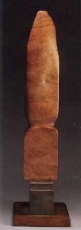
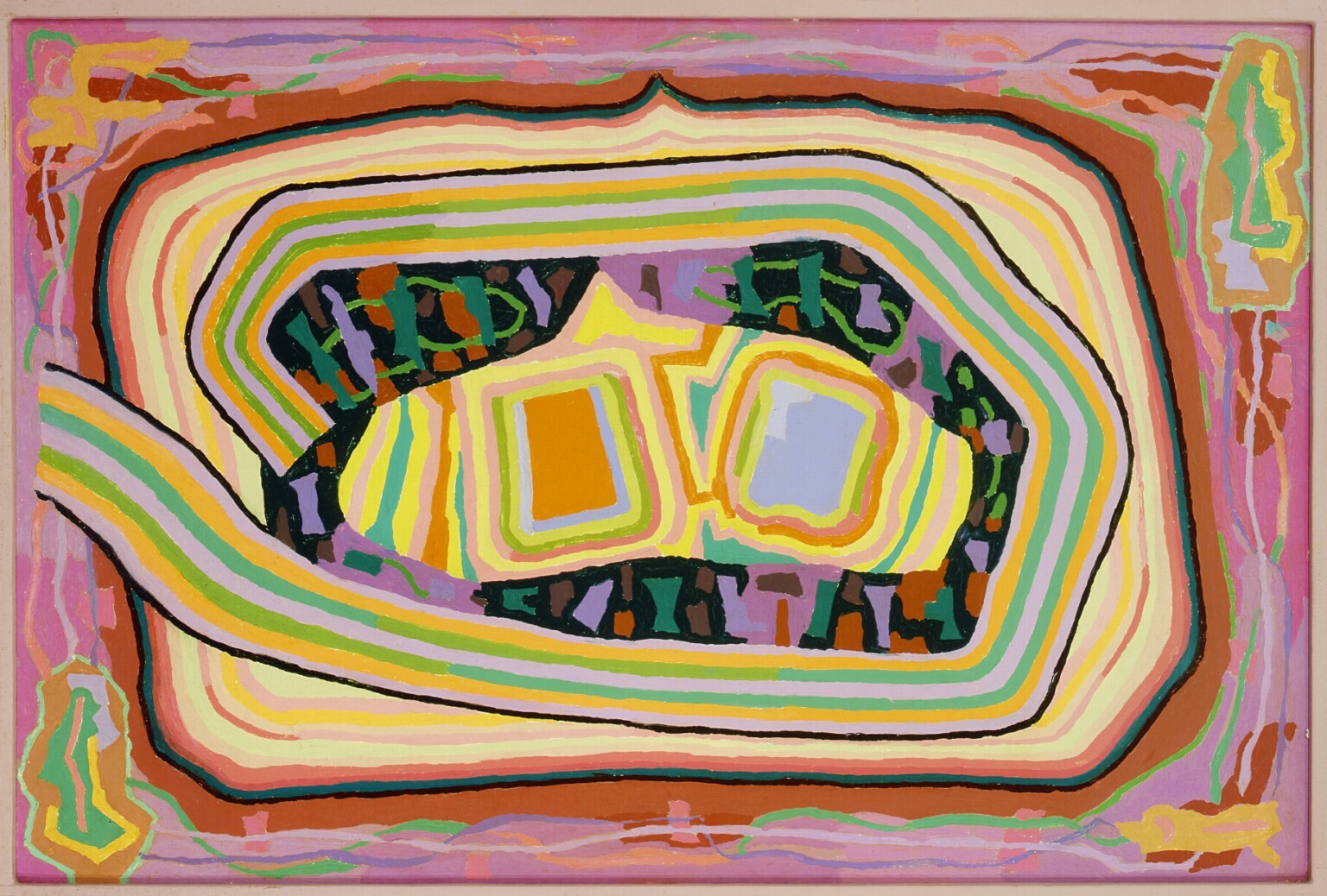
In 1923, Krasnow purchased a parcel of land from photographer Edward Weston and built his studio.  Weston became a lifelong friend and Krasnow s0on found himself in a loose knit  group of  avant garde artists.  His palette changed to  lighter and airier colors that infused his landscapes.  After moving to France then returning he began experimenting with abstraction, both in paint and in sculpture, carving wooden totem-like pieces.  It was this work, along with his work as a printmaker, that occupied his career until his death in 1979 in California.

While he is not tremendously well known nor has his work achieved astronomical prices at auction, his impressive body of work work is vibrant and deserving of greater attention.  I really enjoy seeing the course of his work throughout his career, seeing the connection in seemingly disparate styles.  I know that I am glad to have come upon his work and will keep doing some research.

Krasnow  Self Portrait 1925

Peter Krasnow- Self Portrait 1925

Enigma (K-2) Krasnow  Totem Sculpture Krasnow  The River 1959

Read Full Post »

GC Myers- Steps to Solitude smMaybe I decided to use this image  because it was -8° when I headed out for my stroll through the woods to the studio.  Well, not really a stroll.  More like a hard determined march, trying to cut through the sharp cold as quickly as possible.  But as I glimpsed at the still dark sky,  Venus  was shining brightly just above the treeline, so much so that it caused me stop and just wonder at its brilliance.  To my eye it had a reddish glint that made it seem  like some exotic little gem in the sky.  Beautiful enough to stop me in my frozen tracks.

This brought to mind the upcoming  Little Gems show at the West End Gallery in Corning that opens next Friday,  February 7th.   I am currently prepping a group of paintings for this exhibit of small work which is always one of my favorite shows of my painting year and one that always brings back good memories.  As I have noted here in the past, the Little Gems show in 1995 was the first opportunity I had to show my work in public.

A first step on a then unknown path.

This will be my twentieth Little Gems show, something which would have seemed unfathomable back at that first show.  I don’t paint as many small pieces in recent years, spending more time on larger work, so this is always a great time to revisit the small form.  There is something  wonderful in seeing the colors and forms compressed into a smaller space, something that brings out the gem-like quality in each.  Each element, each mark takes on greater weight in the smaller form.  There’s a different type of concentration, one that is  quicker in its self-editing and one that is definitely more intuitive.  The sizes are such that everything just happens quicker and there is less time to ponder.

And that is often a good thing.   I’ve often said that I’m not smart enough to paint when I have to think about it.   Maybe these small pieces are  proof  of this.

**********************

This piece is called Steps to Solitude and is a compact 3″ by 6″ painting on paper.  It will be at the West End by the end of this week along with several other small pieces.

Read Full Post »

Pete SeegerPete Seeger died yesterday at the age of 94.  He had a pretty remarkable life, using the power of music as a hammer to pound against the powers of social injustice.  The thing that I admire most is his always evident conviction to whatever cause he was devoted.  For as gentle and jovial a man as he appeared to be, there was no wishy-washiness in Pete Seeger.  He always spoke the truth to power on the most pressing matters of the day– the labor movement, civil rights, the Viet Nam war and the environment.

Of course, anyone with such strong and visible views, wil have some controversy surrounding him and Seeger was no different.  He was blacklisted in the 1950’s for his early affiliation with Communism and his slowness to finally condemn Stalin followed him through the years.  But, to his credit, he did own up to his actions and admit mistakes when he felt they were made.  Probably more so than most of those in power would be willing to admit.

Of course, the music is the legacy of Pete Seeger.  Songs like If I Had a Hammer , Where Have All the Flowers Gone?  and Turn! Turn! Turn! have  all have been covered innumerable times, becoming so ingrained in the American songbook that it seems hard to believe that they weren’t written even longer ago than they were.  Well,  the lyrics of  Turn! Turn! Turn! were a bit earlier as they use the words from Ecclesiastes in the Bible.  I grew up with a single of the Byrds’ version of  Turn! Turn! Turn! never far away from our old stereo console and I still get a chill when I hear those opening chords and a little teary when I listen to the lyrics..

So, for  Pete Seeger, to every thing there is a season.  Thank you.

Read Full Post »

GC Myers- California Dreaming 2014It’s another clear and cold winter day, about 4 degrees outside .  It’s visibly beautiful with the crisp and sparkling snow clinging to the pine boughs.   The contrast between what I see out the window of the studio and what I am seeing in my mind is often hugely different.  This new painting is such an example.

It’s a 36″ by 36″ canvas that I am calling California Dreaming.  It was not done with intention but as I was finishing it I couldn’t shake the feeling that this large piece reminded me of California, at least in some microcosmic way.  The mountains in the rear remind me of the Sierras rising from the Central Valley and even the two smaller hillocks in the foreground felt a small bit like the coastal hills.  When you added in the warmth of the colors, it just felt very California to me.

Having this on the easel then turning my head 90 ° to look out the window is quite the contrast.  Both make me happy but they are worlds apart.  At least, a continent and several temperate zones apart.

The title is, of course, a reference to the famous The Mamas & The Papas song, although my favorite version, out of  the many done of this song, is from Jose Feliciano.  Here’s a really nice instrumental version done by an exceptional guitarist, Michael Chapdelaine.  Enjoy and have a great day, whether you’re warm or just dreaming.

Read Full Post »

George Seurat -Paysage Avec ChevalI subscribe to a service that provides information such as auction results for artists, both living and dead.  It is always interesting to scan the auction results for my favorite artists, to see how they are currently viewed by buyers.  For example, anything by Vincent Van Gogh still draws huge money, even the work that doesn’t possess the signature brushwork and color of his better known works.  Those pieces that do, go for astronomical sums.  His popularity with the public is as strong as ever.  I guess that is no surprise.

A_Sunday_on_La_Grande_Jatte,_Georges_Seurat,_1884.It’s also interesting to scan the results to see other work from artists than that which we know them by that hangs in museums.  We tend to think of artists by their best work and seldom see the complete chain of work that runs through their career, never really seeing their weak links or developmental work.  The image at the top, Paysage Avec Cheval,  a painting that goes up for auction at Christie’s London, is a good example of this.  It’s a lovely piece but you might not guess the artist.  This is from George Seurat whose work, such as his most famous work shown here on the left,  is forever tied to pointillism.  But scanning through his records, you can get a better sense of the evolution of his work.

I am also looking for consistency in the artists whose work I am scanning through.  Again, we always think of the artists in terms of their best known works and are often unaware of the totality of their body of work.  Some artists are incredibly consistent, even in their early formative years.  Others have high peaks and deep valleys, with a huge disparity between their best and not-so-best work.  I am always encouraged by both types of artists.

I strive for consistency in my own work but have had dips and valleys in my work, particularly in the formative days early on.  In those days, I thought of the great artists only in terms of their best  works that hung in the great museums of the world, thinking that they simply got up each day and turned out incredible work.  I could not fathom the possibility that they had swings and misses.  It’s encouraging to see that those icons whose work I revere often struggled in the same way as me and that the great works we know them for were not created in a vacuum.  They came with great effort and day after day of moving ahead in often small increments.

I think any aspiring artist should take a few minutes to look through the whole of the works of their heroes.  They might be encouraged, as I often have been, to know that the path they are on is not so much different.

Read Full Post »

Boss Guitar

Wes montgomery- Boss Guitar album coverIt’s a frigid winter morning with  temperatures below zero and a fine gray mist of snow filling the view from my studio windows.  It would be easy to mope around on a morning like this but I am in the mood for something light.  Airy and alive.  I flip around looking for something thta fits the bill and settle on a little Wes Montgomery, the late jazz guitarist who died way too early and was one of the most influential players ever, spurring on guitarists of many genres with his distinct playing.

You can easily see the unusual stance of his right hand as he plays, splayed out and set in one position against the body of the guitar while his ultra-flexible thumb does all the dancing on the strings.  It was said that he had a corn-like callous on his thumb that acted as a pick, the hard parts of providing sharper tones and the softer parts the more mellow sounds.  It’s the style of a self-taught artist, which I appreciate.  That and the fact that he, much like BB King, could not read music. Amazing.

Wes Montgomery died in his home in Indianapolis from a heart attack in 1968.  He was only 45 and at the peak of his career.  Makes you want to take advantage of every moment, not knowing what you will leave undone when your time comes.

Here’s a track called Jingles from Wes Montgomery in 1965.  Enjoy!


Read Full Post »

GC Myers-2014

I am still taking in this new painting, an 18″ by 18″ piece on canvas that remains unnamed as I ponder it a  bit more.  It is, at first glimpse, a snow painting.  At least, it was intended to be so.  For me, there is something quite challenging in presenting this surface that translates as pristine but, in fact, is far from it, having multiple layers of color beneath it which show through at points.  The edges show a glow of red oxide and violet, giving it a warmth that belies the coolness of the white blanket.  It’s a departure from the snow of Dale Nichols‘  paintings that I showed here yesterday, which is pure and luminous.

The thing that I have found with using the white of the snow is that it really displays the lines of the forms underneath.  The lines of  landscape in the foreground here, for example, really pop off the surface.  This could be a bad thing if they don’t have an organic sense of rightness,  that vague and elusive quality to which I often refer.  I think this piece has it.

While looking at this painting this morning, I began to ask myself, “What if that isn’t snow?”  This change of perspective gave the piece a very different reading , one that I hadn’t thought of when it was being painted but one that might pass through the mind of some folks.  What if this is some desolate post-apocalyptic landscape, devoid of  vegetation and covered in ash and dust?  The ravaged  landscape of Cormac McCarthy’s The Road immediately came to mind.  The painting suddenly took on a different feel but it still felt warm and even jubilant in a way.  As though the Red Tree,  fatigued at the end of that dark ribbon of road, had finally met the warm gaze of the sun that burned through the hazy sky.  The Red Tree was still standing despite the desolation around it and was rejuvenated, lifted up, by the sun’s energy.

It brought to mind the poem Strange Victory from the late Sara Teasdale, a poem that I have featured here in the past.  It is one of my favorite poems and expresses the contrast that I often try to impart in my work.  I think it fits this reading of this painting very well.

 Strange Victory

To this, to this, after my hope was lost,

To this strange victory;

To find you with the living, not the dead,

To find you glad of me;

To find you wounded even less than I,

Moving as I across the stricken plain;

After the battle to have found your voice

Lifted above the slain.

Sara Teasdale

Funny how a simple shift in perception  can alter the whole meaning of a piece.  It was originally meant as snow and will probably remain so .  But for the moment I find myself asking:  Is it snow?


Read Full Post »

Dale Nichols-  Company for SupperMost likely prompted by the recent weather here as well as a desire to try a slight change of palette, I have been doing a small group of snow paintings recently.  I thought I would look at several other artists, especially those with a idstinct personal style,  to see how they handle snow in their work.  One of the artists whose snow works really stuck out  was Dale Nichols, who was born in Nebraska in 1904 and died in Sedona, AZ in 1995.  He is considered one of the American Regionalists,  that loosely defined group of painters whose work  for which I have long expressed my admiration.  

Dale Nichols- After the Blizzard 1967His biography is a bit sparse with but Nichols lived a long and productive life, serving as an illustrator, a  college professor and the Art Editor of the Encyclopedia Brittanica.  He also spent a lot of time in Guatemala which resulted in a group of work with Meso-American forms that is quite different from his Regionalist work.  

But Nichols is primarily known for his rural snow scenes and it’s easy to see why.  The colors are pure and vivid.  The snow, put on in multiple glazed layers with watercolor brushes has a luminous beauty.  The stylized treatment of the crowns of the bare trees adds a new geometry to the paintings.   There is a pleasant warmth, a nostalgic and slightly sentimental glow, to this work even though they are scenes that depict frigid winters on the plains of Nebraska.  free of all angst, they’re just plain and simple gems.

You can see a bit more of Dale Nichols other work on a site  devoted to him by clicking here.

Dale Nichols- The Sentinel Dale Nichols- Silent Morning  1972 Dale Nichols- Mail Delivery  1950 Dale Nichols-  Bringing Home the Tree

Read Full Post »

GC Myers- Mountains to ClimbJanuary is usually a month of probing for me,  a time of looking for a direction in which to move, work-wise.  Sometimes it’s a struggle and sometimes it comes more easily.  I’ve written recently about a feeling of being on a plateau with my work, one that has been my home for quite some time now and one from which I am beginning to feel  anxious to move above.  This plateau feeling has made this January searching more of a struggle than normal, as though I were a rock climber faced with a sheer cliff before me  and can’t quite make out my next move.  I am just standing there looking for an edge in the rock face to find a hold that will me to pull myself up.

Maybe it’s that analogy that brought about this new piece, Mountains to Climb, a 12″ by 12″ canvas.  It features a swirling sky and a more prominent peak  beyond the foothills that have been a fixture in my typical work,  There’s an alluring quality to tall peaks that can’t be denied.  It is both a question and a challenge that stands between you and the horizon: Do you have the will and the ability to climb higher?

It’s a question that still rings in my ears as I stand before my own personal mountain.  I think I have my answer and I am beginning to see a way upward, a first hold to pull myself up.

We shall see…


Read Full Post »

Van Gogh-- Sorrowing Old Man 1890I am a fan of Vincent Van Gogh and  am always surprised when I come across a Van Gogh painting that I can’t remember seeing, especially one that has that powerful quality for which his work is known.  Such was the case when I stumbled across this painting.  It’s called  Sorrowing Old Man (At Eternity’s Gate) and was painted in 1890, just a couple of months before his death.

His signature use of line is evident here, especially in the way he uses the color blue to outline the old man. the man and the chair have a completeness while the floor and the background are sparsely painted, almost not there.  It’s a bit of a departure from some of his better known pieces which are densely colored throughout but it focuses the energy of the painting completely on the old man’s sorrowful posture.  Its simple elegance makes for a strong and moving image.

Van Gogh-- Worn-Out-- Drawing  1881-2This painting was based on an earlier drawing made by Van Gogh in 1882.  During that year and the one before, Van Gogh had done a number of drawings of men and women in states of sadness or exhaustion as he was learning to make lithographs.  It is beautifully rendered and has all of the same power of the final painting.

However, for me, Van Gogh’s signature use of color in the painting is what makes the painting much more memorable and moving.  The painting is so recognizable as being his that it carries the cache of his entire body of work, links into the continuum of energy that runs through his paintings.

I am glad I stumbled across this treasure.  While I don’t paint in the manner of  Van Gogh, I find there is almost always something to be learned, always something that can be applied to my own when studying his work.  I think I will look at this a bit longer.

Read Full Post »

Older Posts »

%d bloggers like this: