Feeds:
Posts
Comments

Posts Tagged ‘Eyvind Earle’

**********************

Then very slowly I go to slightly lighter colors until little by little, the forms begin to take shape and I start to see what is happening. Since I never plan in advance, I simply let myself be led by instinct, taste and intuition. And it is in this manner that I find myself creating visions that I have never before imagined. And little by little certain color effects develop that excite me and I find the painting itself leading me on and I become only an instrument of a greater, wiser force…or being…or intelligence than I myself am.

–Eyvind Earle

**********************

I wasn’t going to post anything as my time is very short this morning. But I took a minute and pulled down a book from my shelf and gave it a quick look. It was one of a beautiful two book set of the works and writings of Eyvind Earle, the late artist/illustrator who is best known as one of the lead artists for several of the early animated classics from Walt Disney.

There’s much I am drawn to in the graphic works from Earle– the colors and the rhythm of his landscapes, for example. But today I came across the short piece of writing above that I had somehow overlooked before that gave me some insight into my attraction.

As he described his process, I was struck by how similarly we describe how we work such as not planning anything in advance, working from light to dark colors and following the excitement of certain colors until the work seems to be taken out of our hands.

Until we become instruments.

I have described the process and the final creation as being beyond me, the whole of the piece being more than the sum of of all the parts I call myself. I have also described the sense of purpose I feel from these pieces, how I feel connected to something greater. I can’t ever recollect using that term, instrument, before.

It sounds a little presumptuous but it does align with what I have described in the past. And to see that Eyvind Earle felt much the same way about his work  is comforting, especially on those mornings when I feel far removed from anything close to a greater force. Just knowing that the work might take me to that point where I transform into an instrument for something beyond myself makes the day seem easier to begin.

Read Full Post »

It’s a busy morning with lots to be done here in the studio. I thought I’d rerun a post form five years back about an artist whose work always grabs my eye, Eyvind Earle. I’ve added a video featuring his paintings set to a sparse piano score. Enjoy and have a great day.

I recently picked up  the second volume of The Complete Graphics of Eyvind Earle, a 9-pound behemoth of a book featuring the work of the artist who I have written about here once before. It’s an incredible book, full of spectacular imagery and pure color that I find both inspring and humbling. He had a tremendously long career, about 70 years, that began with a one-man show at the age of 14 and continued through stints as a fabled Disney artist. landscape painter, and a graphic artist known for his highly stylized greeting card design. Through it all, there was an amazing consistency and brilliance to the many pieces produced by a prolific artist in such a long career. I find myself overwhelmed by the variety and quality of his work as I go through the book which only covers a small part of work.

Just incredible.

There’s great clarity in the work of Eyvind Earle.  The compositions are often both complex in design but come across as simple, a duality that I really find appealing.  The color is bold and could be a little sharp in tone if it weren’t harmonized so masterfully within the picture plane.  He is a pure genius at handling harmony and contrast– another duality that strikes me.

I also like the fact that Earle was an unabashed landscape artist, feeling no desire to express himself  through figurative work.  He found total expression in his handling of the landscape around him, often depicting the open spaces and coastlines of California. They are not mere scenes but have emotion and a depth that goes well beyond the surface, another aspect that appeals greatly to my  desires for my own work.  In short, it’s just beautiful work and an inspiration with every look.

Read Full Post »

Eyvind Earle Three Oaks
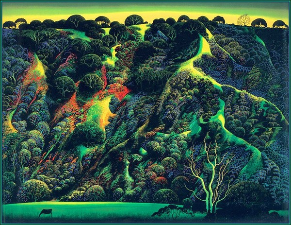
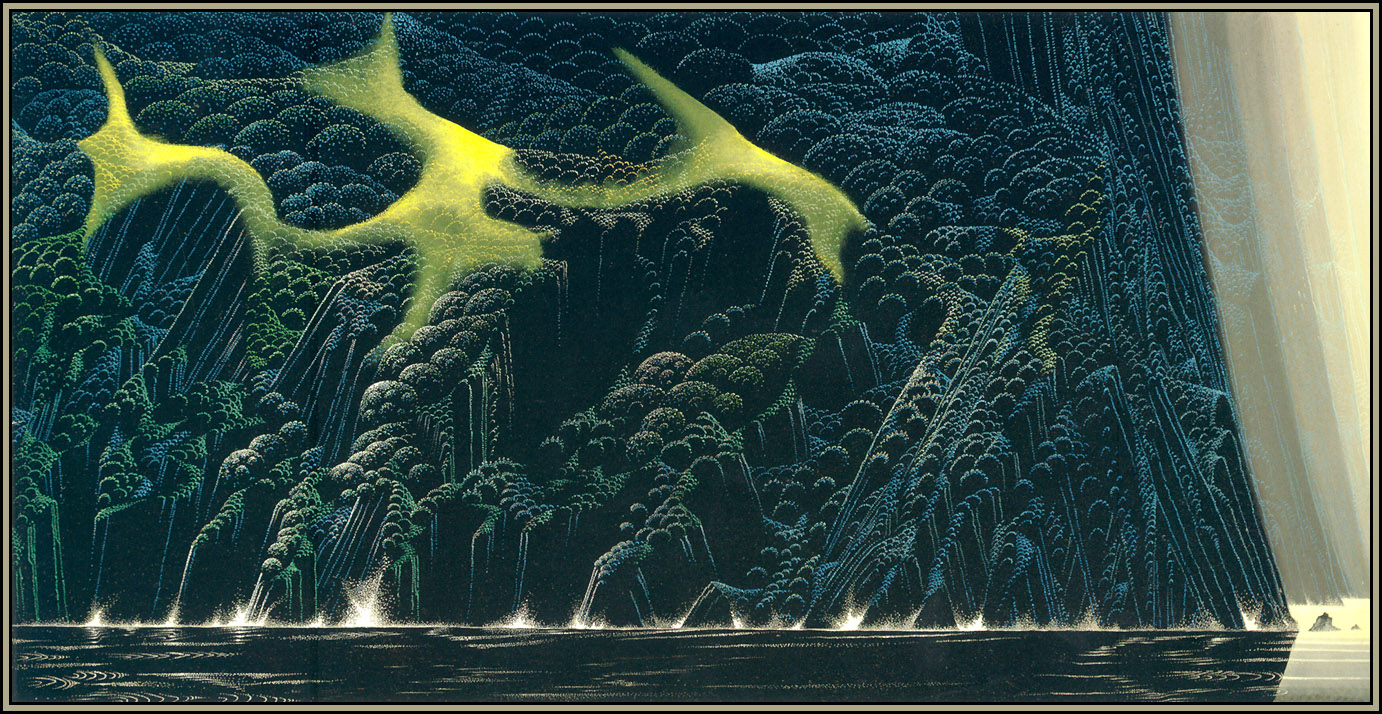
I just wanted to share a few more tidbits from the recent foray out west.   The image shown here is from the late artist Eyvind Earle, who I have mentioned here a couple of times before.  I have quite an attraction to his graphic style and as we finally emerged on our drive westward  from the wide agricultural  central valley  I began to see how the landscape of the coastal hills of California inspired his work.  Golden hills with perfectly crowned oaks placed sporadically upon them were in abundance.  It was hard not to see paintings coming to life as I drove through the hills.

Just before these hills, as we crossed on Rte 46, we came across the James Dean Memorial Junction near Cholame, the site where Dean crashed and died in his Porsche Spyder back in 1955.  It’s a sparsely populated area with little of note anywhere in sight  and it seems like a strange and desolate place for such an iconic figure to have met his end.  Not being a big  James Dean fan, I wasn’t aware of the place beforehand but found the space fitting in an odd sort of way.

But though there are several other things I could recount here, the one I most want to mention is about meeting Mike and Lilia at the opening .  They are from a few hours north of San Luis Obispo and Mike is a police officer in Salinas, a city with a very high violent crime rate.  Mike has formed a connection with my work that really touched me, making me feel as though there was a value in it that I had never seen.  Mike sees a lot of terrible things in his job.  A lot of violence.  A lot of carnage, a lot of  flowing blood.  He has a strong sense of association with colors and it had gotten to the point that the color red was so associated with blood and injury that it bothered him immensely when he came across the color anywhere.

But Lilia and Mike had come across my red trees a while back and the image and the harmony in it helped Mike disassociate the color red from the violence it had come to represent for him.  He found great peace in the work and used it to soothe him after his shifts.  It was a much better choice  for both him and his family than turning to the bottle, as he pointed out to me during the show.

That painting, the first they had ever bought, had also inspired a greater interest in art.  Mike is now drawing and going to local artists’ studios near their home, eager to explore more and more forms.  It was wonderful to hear him tell his story.  You could see how art had  affected his life on a deeply emotional level and simply made it better.  You could definitely see it on Lilia’s face as she listened to Mike tell the story.  If no one else had shown up at that show that night, just hearing Mike’s testimonial to the power of art would have made the whole trip worthwhile.

I really wanted to mention Mike’s story.  It makes my work here in the studio feel much less solitary, as though the eyes of Mike and Lilia are present.  I consider that my gift from California.


Read Full Post »

I recently picked up  the second volume of The Complete Graphics of Eyvind Earle, a 9-pound behemoth of a book featuring the work of the artist who I have written about here once before.  It’s an incredible book, full of spectacular imagery and pure color that I find both inspring and humbling.  He had a tremendously long career, about 70 years, that began with a one-man show at the age of 14 and continued through stints as a fabled Disney artist and graphic artist known for his  highly stylized greeting card design.  Through it all, there was an amazing consistency and brilliance to the many pieces produced by a prolific artist in such a long career.  I find myself overwhelmed by the variety and quality of his work as I go through the book which only covers a small part of work.

Just incredible.

There’s great clarity in the work of Eyvind Earle.  The compositions are often both complex in design but come across as simple, a duality that I really find appealing.  The color is bold and could be a little sharp in tone if it weren’t harmonized so masterfully within the picture plane.  He is a pure genius at handling harmony and contrast– another duality that strikes me. 

I also like the fact that Earle was an unabashed landscape artist, feeling no desire to express himself  through figurative work.  He found total expression in his handling of the landscape around him, often depicting the open spaces and coastlines of California. They are not mere scenes but have emotion and a depth that goes well beyond the surface, another aspect that appeals greatly to my  desires for my own work.  In short, it’s just beautiful work and an inspiration with every look.

Read Full Post »

Eyvind Earle

I  was asked by artist and teacher Dave Higgins to sit in on one of his classes at the local community college last week, to critique an assignment he had given his students.  It was a class that focused on creating digital graphics and animations using primarily Photoshop.  The assignment was to make a graphic based upon one of two subjects.  One choice was to select any sign of the zodiac and the other was based on the term red tree.  For red tree, he gave the students no indication of my work , just the phrase.

This was an entry level course but the work was wonderfully creative.  Of course, being a class of mainly 18 and 19 year-olds, there was a fair amount of angst and morbidity expressed in images of death and plenty of blood.  But the work was great.  I could find something of value in each student’s work, something that showed a real spark of imagination and inspiration.  One of the students who has chose red tree had a simple composition of a weeping willow (that weeped blood!) set on a mound.  Very simple but well done.

The color of the mound set against the silhouette of the willow immediately reminded me of the work of Eyvind Earle.  Earle was an artist/illustrator who died in 2000 at age 84.  He was a child prodigy and had his first one man show at age 14 .  He exhibited his work in shows for many years but gained fame through his stylized Christmas cards throught the years and with his time spent working with Walt Disney in the 50’s and 60’s as a background artist.  He was responsible for the look of many of the animated films of that time from Disney, including the classic Sleeping Beauty.  Shown here is some of Earle’s work from that film.

 I came across his work about the time of his death, seeing ads in framing magazines for prints of his highly stylized paintings.  There was something  very familiar and attractive in the work and upon reading his bio I saw the connection between this recognition and his work from having absorbed it in as the settings and backgrounds for many Disney animations I had seen as a kid.  It was very attractive work, very much of the graphic rather than painterly variety.  Strong colors and great and unusual juxtapositions of compositional elements.  Tree limbs extending into the picture like an arm reaching into the center of the image.  Very evocative as well.  It was easy to see how it was so successful in setting the tone for the action that ran across it in the Disney films and how something like it could have subliminally influenced a young student, or me, over the years.

Here’s a short animation that highlights more of Earle’s work.  I believe this is Russian-made so excuse the error in the title as they switched the names around making him Earle Eyvind instead.  I think you’ll feel that same familarity even though you may never had heard the name Eyvind Earle.

Read Full Post »

%d bloggers like this: