Feeds:
Posts
Comments

Posts Tagged ‘technique’

GC Myers -Simple Glory 2004I have a long list of things to be done this morning.  Since time is short, I thought I’d rerun a blog entry from back in early 2009.  It concerns the question of how long it takes to finish a painting, a question that has been asked of me many, many times. I usually tell the story of a commission I did for a Finnish diplomat a number of years back and how the work I did on that piece became the template or rehearsal for a larger piece soon after.

The answer that I gave in 2009 still pretty much applies although I have noticed that in recent years that it is taking me longer to finish paintings.  I tend to dwell on them a little longer now and am more apt to set them aside so that I can simply consider them before forging ahead.  But there’s even a variable in that– sometimes the energy and direction of a piece is so determined that there is a danger in losing its momentum by setting it aside.

So there is no one answer to the question.  Here’s what I wrote six years back:

I am asked this question at every opening and gallery talk:  How long does it takes to finish a painting?  

This is a question that I’ve answered a thousand times and I still have to stop and think about my answer. 

You see, there are so many variables in my painting technique at different times that sometimes the actual process can be much longer or shorter on any given painting.  Sometimes I can toil over a piece, every bit of  the process requiring time and thought.  There may be much time spent just looking at the piece trying to figure out where the next line or stroke goes, trying to weigh each move.  Then there are times when the painting drops out effortlessly and I’ll look up after a very short time and realize that it’s almost complete. Any more moves from me and the piece would be diminished.

I often cite an example from a number of years ago.  I had been working on a series of paintings, working with a particular color and compositional form.  Over the course of a month, I did several very similar paintings in several different sizes from very small up to a fairly large version.  Each had a very distinct and unique appearance and feel but the technique and color was done in very much the same way.

One morning at the end of this monthlong period, I got up early and was in the studio at 5 AM.  I had a very large panel prepared  and pulled it.  Immediately,  I started on the panel.  Every move, every decision was the result of the previous versions of this painting I had executed over the past month.  I was painting solely on muscle memory and not on a conscious decision making thought process.  I was painting very fast, with total focus, and I remember it as being a total whirl.  The piece always seemed near to disaster.  On an edge.  But having done this for a month I trusted every move and forced through potential problems.

Suddenly, it was done.  I looked over at the clock and realized it had only been two hours.  Surely, there must be so much more to do.  

But it was done.  It was fully realized and full of feeling and great rhythm.  I framed the piece and a few weeks later I took it to the Principle Gallery in Alexandria, VA. where I had shown my work for many years.  It found a new home within hours of arriving at the gallery.

I realized at that point that every version of that painting was a separate performance, a virtual rehearsal for that particular painting.  I had choreographed  every move in advance and it was just a matter of finding the right moment when plan and performance converge.

 It had taken a mere two hours but it was really painted over the course of hundreds of hours.

I hope you can see why I always have to think about this question…

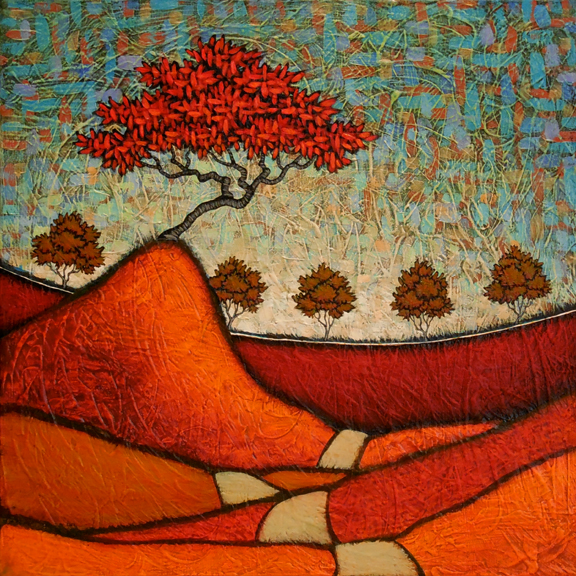
[ The painting at the top is titled Simple Glory from 2004 ]

Read Full Post »

GC Myers- Secret of All TriumphsPerseverance, secret of all triumphs.

–Victor Hugo

**************

Sometimes sticking with a piece that is in trouble pays off.  The painting shown at the top, a 20″ by 20″ canvas that is yet to be titled, was started several weeks ago.  All of the major forms, including the deep blue sky, were blocked in the transparent colors that I use in my wet or reductive work–that is where the paint is put on thickly then absorbed off of the surface until it reaches a tone that fits my eye.  But it just didn’t ring out, had an awful flatness that just made the whole thing dull.  The colors in the foreground were muddied and blah.

I looked at it for weeks.  Actually, I didn’t look at it that often because it just didn’t have anything to pull me to it.  I got to the point that I avoided looking at it at all.  Finally, I decided to scrap the whole thing.  Paint it over in black and start with an empty slate.

Tabula Rasa.

So I took it down into the basement of my studio where I do apply my gesso and do other sloppy work.  I pulled out a thick brush of black paint and slapped it across the sky and worked it back a few times.  The strokes didn’t go into the lower sections of the painting, remaining only in the sky.  I stopped and took in it for a second, the black brush poised to swat across the center now.  The contrast of the black against the colors made the fields pop a bit, gave them a little life.

Just a little.  Maybe there was something there, a flower that could blossom if I just stuck with it a little longer.

So finished the sky in black and in a few days brought it back to the easel.  Each stroke of color that went against the black surface of the sky brought it more and more to life.  When the sky was close to being finished, I went back into the lower fields, glazing them with new layers of color that took away some of the dullness that had plagued them.  The sky had a pop now and the lower fields were catching up to it.  But the central field between the curved horizon and the large mound on which the Red Tree would stand was still an awfully dull green that sucked the life from both the top and bottom.  A sucking vortex.

Maybe this wasn’t going to work after all.  One element so out of kilter could kill the entire thing, break its fragile life force.

After a while I thought that the black had worked so well in the sky, why not break it out in that central field.  Go completely in a different direction with it– make it a red field that would pop in the center of the piece and give contrast to both top and bottom.  Instead of sucking life from it, it would now give it life. And sure enough, it brought everything together.  Even before the trees made an appearance, it was ebbing with life. And when they did appear, it felt complete and alive.  All that I can ask of it.

Now I can’t stop looking at this piece that once made me grimace.  Perseverance pays off in the end, as it usually does.

PS:  Now that I look at this piece after writing this, I believe I will title this painting Secret of All Triumphs. Thanks for the inspiration, Mr. Hugo.

Read Full Post »

2015 GC Myers WIPWhen I finished up in the studio yesterday, I was at this point in progress on a new painting.  It is a 20″ by 60″ canvas that was started with only the thought that it would be curtained in by two layers of tree trunks on each side.  The basic composition of the entire piece is laid in in an underpainting of red oxide and there are a numbers of layers of color in the sky, beginning to give shape to the tone of the painting.

It has definition and purpose now.  A forseeable destiny.

This is one of my favorite stages of my process.  The bones and form of the painting have been created, the decisions concerning composition made, and the painting begins to stir to life.  There is a keen sense of sharpness to it at this point, as though the essence of its being has been boiled down and captured in this layer of red oxide paint.

Like a revealing of its soul.

The layers that will follow will give detail and nuance to round out its wholeness.  It’s interesting  to watch it go from this sharply defined revelation of self through the series of transformations brought on by each subsequent layer of color.  There will be points when this sharpness will fade completely away, leaving the piece dull and flat–barely alive.

Sallow. Like a patient on a respirator.

At that point,  I sometimes finding myself questioning my prior decisions and asking if the piece will ever come back to life.  This comes near the end and, disheartening as it sometimes is,  would be my least favorite part of the process if not the fact that I have the knowledge of and confidence in what will soon take place on the canvas.

The layers of color come quicker and consist of fewer strokes but each small move now seems to bring more and more of a change to the piece.  The soul of the painting that once filled the canvas in the completed underpainting above now begins to reveal itself again in its fullest form.

Now, that being said, it what I hope happens.  Sometimes it just doesn’t.  But sometimes the soul of the piece is revealed so strongly at this point that it will not be denied.

And that’s what I believe will be the case with this piece.  At least, that is the hope.  We shall see…

Read Full Post »

I wrote this post several years ago describing how a certain composition from one artist can influence another, even though the results may seem light years away.  I often look at work of others in different ways, sometime focusing on the quality of the colors or how their handling of the paint.  But  often  I find myself looking at how the composition comes together, breaking away the the surface details in my mind to reveal the  bare bones or armature underneath.  Sometimes this sparks something and while looking at someone else’s work I will see a painting of my own growing over this armature.

I thought today I’d recall how this worked with a very famous piece:

WhistlerThis is James McNeil Whistler’s most famous piece, Arrangement in Grey and Black, No. 1:  Portrait of the Painter’s Mother.  It is, of course, better known as Whistler’s Mother.  It was a painting that I was casually familiar with as I grew up but it wasn’t until I looked more closely at it after I had started painting that I saw the brilliance of it’s composition.

Whistler always asserted that the painting was not about his mother but was more concerned with creating mood with color and composition, which the primary focus of almost all his work. This piece achieves it’s mood with beautiful diagonal lines formed by the woman’s form and contrasting verticals and horizontals that create great visual tension and energy.  The stark whiteness of the matted print on the wall behind shines like a full moon against the pale blue-gray sky that is the wall itself.  The head of the old woman seems to be almost lit by the light from the moon/print.

This is not a portrait of an old woman.  It’s a nocturnal landscape.  That’s what I saw when I looked at it as a painter trying to glean what I could from it for my own use.  This was a composition that had a geometry that just felt so right immediately.  It had such a sense of perfection in the way color and form combine with sheer simplicity that I knew I would have to use it for myself.

And I have, quite a few times over the years since I first really looked at it, sometimes with slight variations in the placement of the elements but still basically with the same compositional base.  And inevitably, they are pieces that have great immediacy in their impact, pieces that carry great mood whatever their subject matter.

The following day I wrote:

Yesterday I wrote about how I have often used in my own work the composition from the James McNeil Whistler painting popularly known as Whistler’s Mother.  I did so without illustrating the point so I thought I’d take quick moment to show how I might block in my own work with Whisyler’s composition.

GC Myers - the-way-of-lightGoing into my archives, one of the first things I look at is a painting from a few years back, The Way of Light.  At first glimpse, this piece has nothing in common with the Whsitler piece.  First, it is not portraiture ( although I often view my trees as such) and it is a landscape.  It is obviously a different palette of color than that of Whistler and the elements are rendered in a less realistic fashion than you would see in Whistler’s work.

WhistlerBut if you put those differences aside and quickly take in the shape and form of each piece, you can begin to see the similarity.  The line of trees on the small mound of land in my piece take the place of Whistler’s dark curtain on the far left.  The water in mine becomes the floor of his. The body of his mother is replaced by my island and her head becomes my red tree.  The framed print is now my moon.

Here, I overlaid my piece with the Whistler piece to further illustrate the point.  Obviously, there are worlds of differences separating the two pieces, as I pointed out above.  But the composition and use of blocking and light help us each achieve a sense of mood that is the primary goal in both cases.  Like Whistler, I am often more concerned with the mood and emotion of a piece of work than the actual subject matter.  In this pursuit I have come to view much of my work as Whistler did his, as musical compositions rather than merely representative images.

In color and shape there is rhythm, tempo and tone.  The placement of the compositional elements of a piece are much like the placement of individual notes in music, each affecting and reacting with those around it.  All trying to evoke feeling, response.

Well, there’s my illustration of how Whsitler’s iconic piece fits in with what I try to do with my work.  Hope you can now see the connection…

Read Full Post »

GC Myers 1994 Early ReductiveWork6I have been spending a lot of time here in the studio in the last few weeks painting in a more traditional manner, what I call an additive style meaning that layers of paint are continually added , normally building from dark to light.  I’ve painted this way for many years but much of my work is painted in a much different manner where a lot of very wet paint is applied to a flat surface.  I then take off much of this paint, revealing the lightness of he underlying surface.  That’s a very simplified version of the process, one that has evolved and refined over the years,  that I, of course, refer to as being reductive.

When you’re self-taught, you can call things whatever you please.  I’m thinking of calling my brushes hairsticks from now on.

This reductive process is what continually prodded me ahead early on when I was just learning to express myself visually.  I went back recently and came across a very early group of these pieces, among the very first where I employed this process.  I am still attracted to these pieces, partly because of the nostalgia of seeing those things once again  that opened other doors for me.  But there was also a unity and continuity in the work that I found very appealing.  Each piece, while not very refined or tremendously strong alone, strengthened the group  as a whole.  I would have been hesitant to show most of these alone but together they feel so much more complete and unified.

This has made me look at these pieces in a different light, one where I found new respect for them. I think they are really symbolic of some of  what I consider strengths in my work, this sense of continuum and relativity from piece to piece.  It also brings me back to that early path and makes me consider if I should backtrack and walk that path again, now armed with twenty years of experience.  Something to consider.

GC Myers 1994 Early ReductiveWork 1 GC Myers 1994 Early ReductiveWork 3 GC Myers 1994 Early ReductiveWork 5 GC Myers 1994 Early ReductiveWork 2 GC Myers 1994 Early ReductiveWork 4

Read Full Post »

GC Myers- Harmonic OneI call this new painting  Harmonic One.  It’s 14″ by 34″ on paper and is part of my Islander show at the West End Gallery in Corning , opening this Friday and running through August.

This is another of those paintings that I start then set aside, waiting for a moment of clarity when the direction of the painting comes through to me.  Sometimes I set them aside because I simply lose momentum, lose the rhythm that is driving the creative force forward and find myself dulling the painting.  Other times, like this, I set them aside because I reach a point, in full rhythm, where I must choose a direction and cannot because I so like what I see before me that I am fearful that I will make a wrong decision which would destroy everything.

The thing that attracted me to this piece and caused me to hesitate when I came to that point on this piece was the color and texture of the sky.  It was chaotic  and rough with bits of differing tones of blues and pale greens.  It was just alive and seemed to dance on the surface.  There is a detail from the sky shown at the bottom of this post.  I knew that to just jump ahead too quickly would diminish the whole effect of that sky.  It required a focal point that would play off of the chaos running through the sky.

Of course, my focal point, my central character,  was going to be the Red Tree.  But it had to have a certain weightiness, a feeling of strength that would create a solidity that would contrast with the foreboding confusion of the sky and bring the whole into some sort of equilibrium.  In short, a tree that would create harmony.

I repeatedly would put this piece on my table and, time after time, I would take it away without touching it.  I just could envision such a harmonizer.  I was at a point where I was beginning to think that I had created a piece that would never go beyond mere potential.  The finished section began top lose vitality and I thought it would go in the heap with other work that never lived up to their possibilities.

But finally, it showed itself in the form that you see.  It transformed the whole thing, bringing a peaceful solidness and force that brings the chaos of the sky into balance.   The title came easily.  In the end, I was tremendously pleased with this painting.  It had everything that  I looked for in my work–depth, texture, color, contrasts, and a feeling of vitality all in a deceptively simple package.  All that I could ask of it…

GC Myers- Harmonic One detail

Read Full Post »

GC Myers WIP 2013This the piece I showed earlier in the week, a 24″ by 48″ canvas started last weekend.  As you can see by the image to the left, the composition of the landscape has filled in and the sky has began to take shape.   I have laid in several layers of brushstrokes in the sky but probably won’t go back into it until I do more on the landscape below.  The landscape will set the final tone and feel for the sky and I need more color in it to fully be able to read it.

I sometimes question whether I need to have as many layers of color in the sky because  often in the final surface you can’t even discern any of these layers.  For example, there is a layer with  numerous strokes of violet in the sky here that you probably can’t make out in the picture above.  When this piece is complete, you may only be able to see a tiny  hint of  violet at any point in the sky.

Could I skip that layer and several other similar layers?

Sure.  It may not make a bit of difference to the casual observer.  But for me, it is an integral part of the process, a  slow development of the depth and complexity of the color that I am seeking, a color that I won’t know until it finally shows itself.  That little touch of violet is necessary for me, an important step that, if skipped, would have me thinking that something was amiss in the picture.

DSC_0011 smLeaving the sky, I begin to lay in preliminary colors for the landscape, a variety of blues and greens for the trees and a brownish  putty color for the houses and a bit of red for the roofs. It’s always exciting at this point because the color begins to bring real shape and life to the landscape.  As  each house comes to life with a little color as I work across the canvas, it is like there is a wave of light moving over it.  The whole surface begins to feel animated.

DSC_0014 smAfter that layer, I begin to lay in the surface of the landscape with a multitude of colors, weighing each block of color  as I place it  to get a sense of how it fits into the rhythm of the whole.  I begin to put on what may or may not be final touches on some of the houses, slashes of white that glows on the canvas.  I really am beginning to feel the direction of the painting at this point and have a sense of where it may finish, starting to think how I will handle the blackness of the lake.

GC Myers WIP DetailI know that this sounds goofy and I can’t really explain in any coherent manner, but there’s a good feeling around this painting at this point.  I like it’s strength and think it will show dynamically in its final state.  I really like it so far and like a few of the details in it that are new to my work.  For example, this scene has a small church graveyard  with a road circling it as it overlooks the lake.   Although I sometimes reference death and the past in my work and have a great personal fondness for graveyards, I have never actually portrayed a cemetery in my work.  But I really wanted to show it as part of the community of this painting.  It somehow tempers the piece for me.

So, while the painting is beginning to take shape, there is still a ways to go before I can sit back.  I am still trying to see what the final focus of the piece will be, what will give me a name that fits it.  Perhaps I should ask you for some help.

Shall we have a Name That Painting Contest?


Read Full Post »

Left Side detail

In my last post, I wrote about how I was going over the large canvas on which I am currently at work, weighing the different elements against one another as I try to create balance in the composition.  It’s a large canvas, 54″ by 84″,  and there is so much more space to oversee, making sure that one area doesn’t so dominate the whole.  In a large horizontal landscape composition, if the one side is overly dominant, making the other seem weak or dull, the entire piece suffers  no matter how wonderful the strong area may be. 

  The right side with the heaviest grouping of houses  was very strong in the overall composition and I found my eyes always settling on the right side of the canvas.  There just wasn’t enough boldness in the sections to the left of center to counter the weight of the houses.  I wasn’t about to add more houses or elements so I decided to turn my attention to heightening the colors and contrasts on the left side, strengthening it so that it came closer to the right in weight.  I spent a day just going back in with colors that brightened the area and brought more attention to it.

Right Side detail

I decided to better see the strength of the different areas I would break up the canvas into sections on my computer. This would let me see their strengths without the influence of the surrounding areas and evaluate them as individual compositions.  The right side  (shown to the right here) was bright and strong with the houses just dominating the area.  But after making the changes on the left side ( the image above) I found that it had tremendous strength of its own and was equal in strength to the right, at least in my eyes.  The strength of the left side, for me, was in the weight created by the harmony of the colors and the elements.  In fact, looking at the left side detail above, I think that it could stand easily as a  really strong piece on its own.

 
Satisfied with this progress, I can now start to evaluate other parts of the painting and make the final touches that will hopefully pull it all together.

Read Full Post »

I’m in the final stages of finishing the  large canvas that I’ve been documenting here, spending a lot of time weighing the weight of the colors and forms and adding a bit here and there to bring it into balance.  It’s slow work and sometimes I have to just get away from it to clear my head.  I have spent this time working on finishing a few other paintings that have been in hanging in limbo for some time, in various stages of semi-completion.

One such piece is shown above, In the Early Morning, a 12″ by 36″ canvas that I started some time ago and just couldn’t get it past the initial stages of laying in the composition and several layers of color on the sky.  The color just wasn’t working for me on this piece and I wasn’t excited by where it seemed to be heading.  So I put it aside, thinking that eventually I might try again.  I usually do try again although there is one similarly sized canvas in my studio now that is about a year old and about which I seem to have enthusiasm.  That piece may just end up getting painted over if only to get it out of my sight and mind.

On the other hand, this painting survived its time in limbo and I find myself glad of it.  It felt, the more I looked at it, as though it needed a single color to bring it together thematically.  I initially thought of making it a nocturnal scene but could see that, while I wanted the color to be blue, I wanted it to be lighter.  It ended up being more of a dawn scene, a time to which I am attracted to naturally, both personally and in my work.

I don’t know what this piece is saying yet but it doesn’t matter to me now.  It has a placid feel and I find the blues soothing throughout this scene.  It’s beauty is enough for now– in the early morning.

Read Full Post »

I’ve been documenting the progress  that has been made over the past two weeks on a large canvas on which I’ve been been working.  It’s been a roller coaster of emotion for me as I’ve been working on the 54″ high by 84″ wide painting.  Sometimes I am completely satisfied, thrilled with what is unfurling before me, and at other times I am worried that it may not pop in the way I envisioned in earlier stages.  At the moment, I am closer to happy as the piece has started to come into full sight.

After beginning to bring more light to the sky, I have started adding color to the lake that dominates the center of this piece.  As I do so, I can better see tweaks that need to be made in some of the colors of the landscape around it.  Nothing big but small adjustments that bring it closer to completion. 

After coming to the still dark blue color as shown above, I decided that I wanted the color to be more dominant and added a light teal that really emboldened the whole composition.  I have to better photograph this so there is a bit of glare on the image below.  I also noticed that the sun is showing a bit harsher here, less warm than it actually is.  But this gives you an idea of what is there at the moment.

This painting pretty much dominates everything in the studio at the moment.  It’s big in size and visual impact and my eyes immediately fix on it.  There is still a ways to go but it’s coming closer to being the internal landscape that I envision.


Read Full Post »

« Newer Posts - Older Posts »