Lately I have been thinking about how people find their individual creative voices, how it evolves and is influenced by what others think. We all too often heed advice that fits in a one-size-fits-all world when we need direction that takes in account the singularity of our talents and our aims. Many of us also dismiss the creative expressions of our emotional selves as somehow inferior to those from known creative talents as though they had a monopoly on the feeling and expression of emotion. I think the individual voice grows when they transcend this feeling and realize that their point of view is as valid as that of any other person, including the greatest artists working in their field.
There is a lot more than can be said on this subject but it brings me to a post that I wrote here back in February of 2009 that describes how I came to this realization of my own validity. I wonder how many artists, writers, musicians and other creative people have experienced this same sense of inner intimidation and have succumbed to it, putting aside their quest for their own voice?
****************************************
 When I used to enter a gallery or museum, even up until several years ago, I would be filled with a severe sense of dread and anxiety. Angst. The knot in the stomach. The racing pulse. The whole thing.
I would go from painting to painting and would feel lessened because in each piece I would see something that I could not do, some technique that was not in my toolbag. There were colors and forms that I could not replicate and all I could think was that I was somehow inferior.
I didn’t belong.
The resulting feelings would leave me reeling and sometimes angry, making me even more determined to create something that would validate my work.
While this was a motivating force for many years, helping me actually find my voice, it gradually subsided over the years as I became more and more aware that I had been focusing on things I could not control and on being something I was not.
I began to see what I was. I had an individual voice and vocabulary that was mine and mine alone. I began to see that other artists felt about my work as I had felt about their work. I saw that while they were doing things that I could not, the reverse was true as well. I recognized that my voice, my technique and style, was finally mine and mine alone. I saw that my form of expression was every bit as valid as any other artist hanging in any gallery or museum.
This was a liberating feeling. It allowed me to go into galleries and museums and , instead of seeing what I was not, recognize the beauty of expression that was there and be excited and inspired by things other artists were doing. Instead of coming out saying ” I’ll show them ” I was saying “I can use that”.
It was merely a matter of trusting that what I saw in my own work was a true and real expression and would be visible to others. I think this a lesson from which any viewer of art can benefit. They must learn to trust their own instincts and reactions when looking at art. Like my self-expression, their reaction to a work is theirs and theirs alone. Their reaction is as valid as anyone else and no critic or gallery-owner can make a person like a piece that doesn’t move them. When the viewer realizes that there is no right or wrong, that their own opinion is truly valid, their viewing pleasure will increase dramatically.
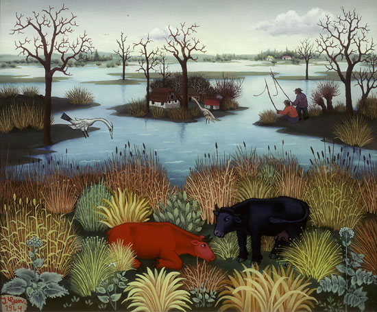
By the way, the piece at the top is an old experiment from around 1994. I always enjoy pulling it out even though it doesn’t fit neatly into my normal body of work. No more angst.
Well, a different kind of angst…
Read Full Post »
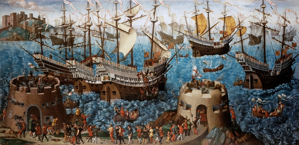 I saw this painting on a PBS program about Henry VIII and Hampton Court. It’s a massive painting, nearly 5 1/2 feet tall by 11 feet long, titled The Embarkation of Henry VIII at Dover, commissioned by the king to commemorate a 1520 meeting at Calais with him and French king Francis I. It was a goodwill mission of sorts, trying to increase the bonds of friendship between the countries after a recent treaty. Of course, only a couple of years later they were at war. But while diplomacy may have failed at least an epic piece of art came from the whole thing.