Feeds:
Posts
Comments

Kabuki TV /Redux

GC Myers Kabuki TV 1994
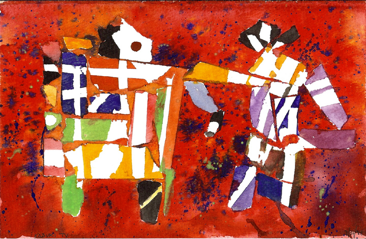
Whenever I come across this little experiment from back in 1994, I linger over it for a few minutes and smile a little.  There’s a lot going on with plenty of bright colors and sharp angles but with a narrative element within it where I saw a person watching a Kabuki performance on their television.  But more than that I am reminded of the decision to move away from this experiment and continue in the direction that eventually led me here.

You see, I enjoyed doing this work, enjoyed the process and the final product.  I could have easily followed this path and been fairly happy.  But it lacked something that while I can’t really put a finger on it was found later in the work that I eventually produced in later years.

Heart?  Soul?  I can’t say.  But it was fun at the time and makes me smile now.  Plus the lesson in learning what you can and can’t be is beyond value.

I wrote a bit more on this subject, also set off from this little painting, back in 2010:

Just looking through some old things, mostly little pieces that are from the time when I first started painting, and I came across this.  At the time  I was playing around with color and masking, where you put something such as tape on the painting surface and paint over it then peel it away to reveal the unpainted surface underneath.  It can be a big part of traditional watercolor painting and I wanted to see if it fit with the way I thought and wanted to paint.  It didn’t.  But I did come up with this little abstraction that always catches my eye and makes my mind’s gears turn.

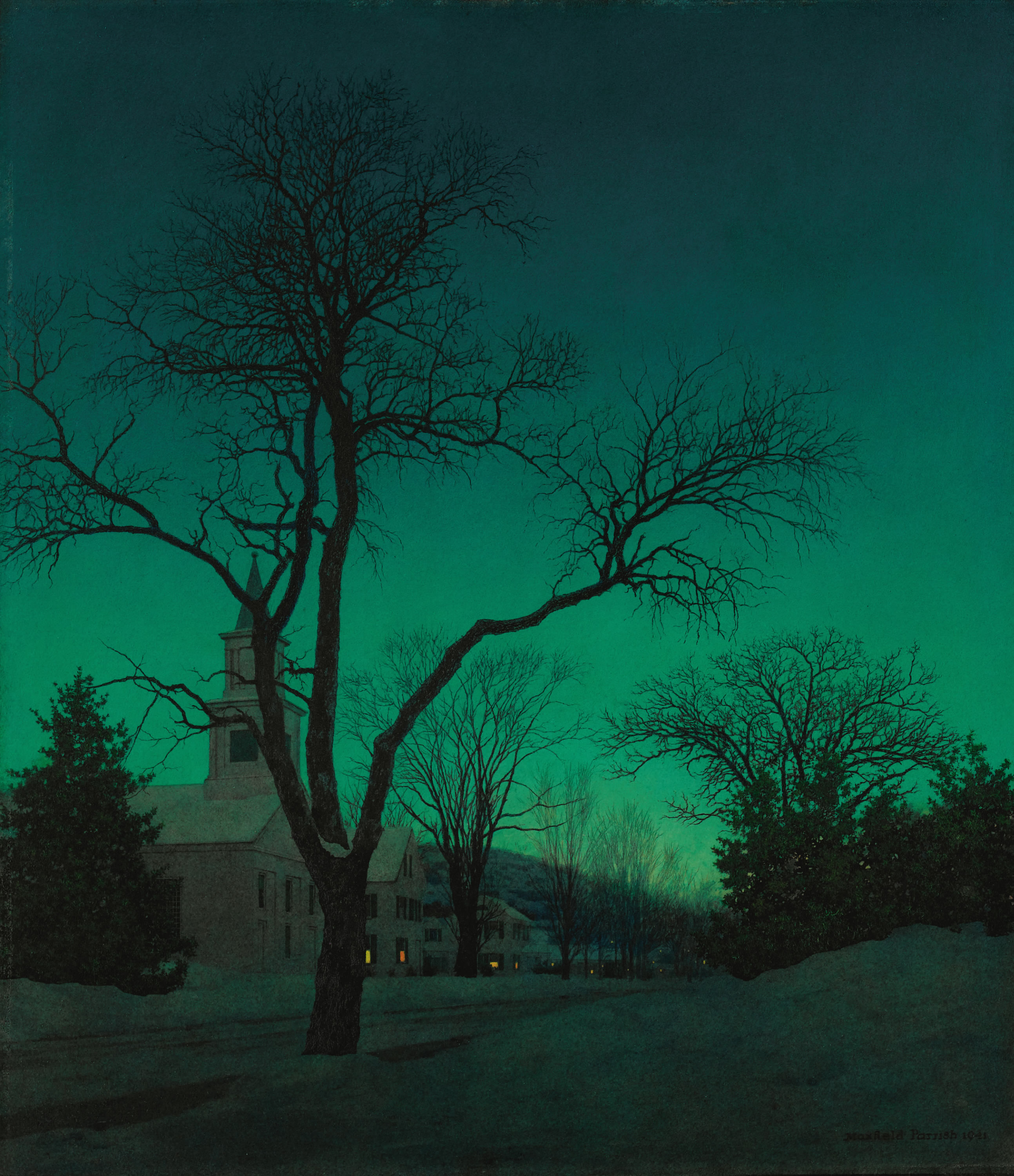
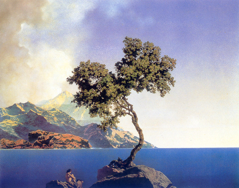
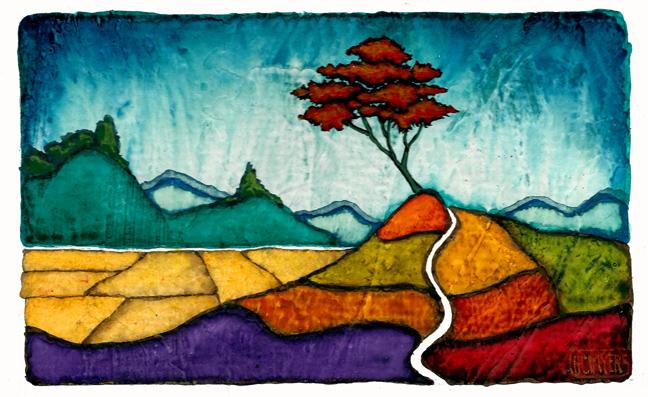
It’s always interesting to see these little pieces because it inevitably triggers memories of that time when every day was bringing new discoveries as I tried to learn more and more about color and different mediums.  Sometimes things clicked and it was revelatory to discover my strengths.  Other times, it was a struggle and the end product was muddled, labored.  But there was still something to be learned there.  Like identifying my weaknesses and learning how to strengthen these areas or, at least, downplay them.

I guess that this is the process for development in any area of your life,  playing up your strong suits and trying to cover your weaknesses.  Perhaps that is why I like to see these old experiments, to be reminded of my growth, artistically and personally, through the years. 

At least, what I perceive as growth.

Maxfield Parrish- Daybreak

Maxfield Parrish- Daybreak

I saw this year’s schedule for the Fenimore Art Museum in Cooperstown and was excited to see that on it there was  an exhibit of work from the great Maxfield Parrish. Titled Maxfield Parrish: The Art of Light and Illusion, this show opens May 23 and features 45 pieces– paintings, prints and sketches– as well as some of the props for which he was well known for using.  Here is how the Fenimore describes Parrish’s career on their site:

As one of the most popular American artists of the twentieth century, Maxfield Parrish created fantastic images of fairy-tale figures and idyllic landscapes in a style that was all his own. Through a prolific career that spanned from the 1890s through the 1960s, Parrish became one of America’s first truly “public” artists. The mass reproduction of his paintings—originally intended as book and magazine illustrations, advertisements, calendars, and murals—ensured his reputation as one of the most widely-known figures in the history of art. It has been said that in 1925 a lithograph of his most well-known painting Daybreak [seen at the top of this page] could be found in one out of every four American homes.  Parrish’s magical artwork continues to capture the imagination and inspire today’s artists, musicians, and filmmakers.

Maxfield ParrishI have written here before that he was an influence on my work, especially in the luscious quality of color that he used in almost all of his work.  I liked his better known works, such as Daybreak, here at the top, but it was his lesser known work, quiet landscapes with compositions that intensified the quietness of the solitude they portrayed, that were my favorites.  But I have never seen many of his pieces in person and am really looking forward to being able to closely examine them in the intimate space of the Fenimore.  There is something about seeing the hand of the artist on the surface of a painting that makes me feel somehow connected to the artist, that allows me to imagine them at work at that particular moment when they made that mark.

If you have seen much of my work you will probably recognize Parrish’s influence that I took from the painting below, Aquamarine.  The shape of the tree and the promontory on which it stands, the proportions  of sky and sea, and the way the land sits on the horizon all found their way into my own vocabulary.  More than those obvious elements was the emotional tone that I saw in it and wanted for my own work.

Just great work and a show to which I am really looking forward to seeing up close.

maxfield-parrish-aquamarine


Hasten Down the Wind

GC Myers-Hasten Down the Wind smThis is a painting  that I finished over the weekend.  It’s 10″ by 30″ on canvas and is titled Hasten Down the Wind.  If that sounds familiar you probably remember the old Warren Zevon song from the the 70’s most famously covered by Linda Ronstadt on her album with the same title.  It was a pretty big album at the time.  I just always loved the imagery in that phrase– hasten down the wind– and thought it fit well with this piece.

The song is about the end of a relationship, where the girl recognizes that nothing is working for them any more and the guy finally grudgingly admits it as well, telling her to leave , to go hasten down the wind.

I see this in this painting with the Red Tree reluctantly holding onto those leaves as they struggle to depart on the wind even though it knows that it has to be this way, that they must leave.  There is something bittersweet yet liberating in this idea that sometimes things are just not meant to be.  We often hold onto things–people, ideas and hopes and dreams– that don’t truly fit with who we are with the thin hope that things will somehow change to match our perceptions.  But recognizing that this is not meant to be and letting these things go allows us to perhaps find our truer selves.

In short, we sometimes have to lose things to reveal who we really are.

Rumba Nostalgica

 GC Myers- The Song We Carry smIt’s a gray winter morning and what better way to shake off the cold blahs this Sunday than with a little flamenco guitar music.  I am featuring a performance by guitar master Juan Martin of a piece titled Rumba Nostalgica that has a little heat to warm any old bones.

I was talking with someone at the Little Gems opening the other night who commented on the fact that I often show guitarists in my work.  I explained about how I thought the shape of the guitar and the way the player cradled it had a very sensual feel, something very emotional in the way the player’s hands almost stroked the instrument to create its music. Its form and the inherent emotional weight it carried made it a wonderful subject.

I think you’ll see this if you watch the hands of Juan Martin in this performance video.  I myself love watching acoustic stringed instruments being played– everything is right there for you to behold.  The movement of the hands.  The snap of the strings. The rhythm of the two hands working to create something quite extraordinary.

Take a look and just enjoy the moment.  Hope the rest of your Sunday is as bright…


Unpuzzled

GC Myers-Unpuzzled 2015January is always a month of feeling out in the studio, trying to find a rhythm, a strand that I can grab onto and follow into the rest of the year.   Getting  a group of small pieces ready for the Little Gems show at the West End Gallery (which opened last night) is part of this feeling out process, sometimes acting as a preview as to where the work may ultimately lead me.

This year found that group with clear and glowing transparent color that was very gem-like.  The pieces felt like pieces of jewelry as much as paintings to me which is something I might be able to carry forward.

But now it is February and I am beginning to just let things flow as they come out, emotionally based and free of too much forethought.  Just let it happen and not try to direct it too much.  The first piece after the Little Gems  and in this February frame of mind was the piece shown here at the top, an 18″ by 18″ canvas that is called  Unpuzzled.  This is as much a piece for myself  alone as anything I might do, meant to only satisfy my own need to see it.

I wanted to see a harmony of patterns, rhythms and color that was as much non-objective as objective, which is how I could describe just about any of those pieces which most deeply satisfy me personally.  As this piece does.  It’s one of those pieces about which I don’t care what others might think– it works for me.  And maybe just for me but it doesn’t matter.  It just clicks an internal switch for me.

Sitting here at the moment, looking at this painting, makes me want to translate something like it to a much larger format, maybe 4′ by 4′, where the impact of the forms and colors would resonate with the grander scale.

Maybe…

Do not go where the path may lead, go instead where there is no path and leave a trail.

–Ralph Waldo Emerson

*************************

GC Myers- Trailblazer  I chose this little gem of advice from Emerson as the Quote of the Week because I thought it fit so well with the small painting above, a Little Gem itself.  It’s a small 4″ by 6″ painting that is called Trailblazer and is part of the Little Gems exhibit that opens tomorrow night at the West End Gallery in Corning.  I also chose it because those words fits so well for my own experience at the time I began showing my work for the first time, at this very same exhibit twenty years.

I was thrilled to have an outlet in which to show it publicly but was still in the process of finding a singular voice of my own–how my work would be styled.  Part of that process of finding this  was in determining what path I would follow with the work, whether I try to emulate the work of other painters I knew and admired.  That seemed like a natural path to follow, wide and well defined.

 But the path was also crowded.  Sometimes it was hard to distinguish yourself  and find a foothold among so many companions.  But if I set out on my own  that would not be the case.  On the the well-trodden path,  I would always be subject to comparison  and immediate critique.  Blazing my own trail would allow me to set my own pace and destination, define my own objectives.

Plus it would be my path alone.  And that was no small thing. In fact, it was a primary goal of  mine.   I had determined from my visits to museums that the work that stood out most for me was the work of artists who you could identify immediately from across the gallery space.  Looking at the shelves in front of me, most of the books are of the works of such artists, all who eventually set out on their own trails and created work from a world that was their’s alone.

I’m still on my path.  I’d like to think it departed from that wider, more traveled path sometime ago.  I can’t be the judge of that.  So I plug ahead with words of Emerson ringing in my ears and hope for the best.

The Need For Speed

Ralph Gorton in Rossion Supercar  on Car ChasersThe guy on the right in the picture here is Ralph Gorton, who owns the Just Looking Gallery in San Luis Obispo, CA, a gallery where I’ve shown my work for three years now.  I had a solo show there in late 2012 and my work has done really well in California thanks to Ralph and Ken at the Just Looking Gallery.  It’s been a great ride but getting to know Ralph a little bit has been a real kick.

He is a a larger-than-life character in all ways, including the height that helped him become a Division I basketball star in his college days.  He is known to be an astute  entrepreneur, a lover of art, a well-known college basketball coach and mentor, an athlete, a father and husband, a mountain climber and wilderness explorer, a sometime model (there’s a story there!) and a world-class storyteller.  And a pretty good guy , to boot

I think he would be a perfect specimen for reality television.  Well, tonight he makes it there on The Car Chasers on CNBC at 10 PM.  It’s a show where they try to locate specific cars for would be buyers and Ralph is in the market for a Rossion Supercar, a limited edition hand built sportscar built here in the US that has crazy speed.  Zero to sixty in 2.8 seconds.

Here’s a link to a short clip from tonight’s episode.

And in case you were wondering what it feels like to go from 0-60 in under 3 seconds, here’s a video from Tesla who makes a new electric four door sedan with the ability to do just that. It gives you the immediate reactions of a few normal folks who were also wondering.

Serenity Flag

GC Myers- Serenity Flag  smWhen despair for the world grows in me, and I wake in the night at the least sound in fear of what my life and my children’s lives may be — I go and lie down where the wood drake rests in his beauty on the water, and the great heron feeds. I come into the peace of wild things who do not tax their lives with forethought or grief. I come into the presence of still water. And I feel above me the day-blind stars waiting with their light. For a time I rest in the grace of the world, and am free.

-Wendell Berry

**************

There’s something in the design of this new piece that is part of the Little Gems exhibit  at the West End Gallery that reminded me of a flag or banner.  I kept looking at it in the studio, wondering where or what it might represent as a flag, when it came to me: a place of peaceful stillness.  Resting , as Wendell Berry points out in the quote above, in the grace of the world.

A state of serenity.

It’s a small painting, only 4″ by 6″ in size and titled Serenity Flag, but it speaks very strongly to me of the desire to quell the anxieties that often rise up within me and to find that moment of grace where they all dissolve into the stillness.  I’ve spoken here often about this desire as being one of the prime motivators behind my painting and this simple, small piece sums it up well.

I think there’s the possibility that if I ever stumble into that state of placid stillness I will see the Serenity Flag flying.

Born to be Blue

GC Myers  The Blue Cool This is another small painting that is part of  the Little Gems exhibit opening this coming Friday at the West End Gallery.  This is a little 3″ by 5″ piece on paper that I call The Blue Cool.  I guess that it arose from the current frigid temps that we are in here in the Northeast.  The sky here is in three blocks of an aqua blue color that has a transparency that makes them seem like thin slabs of ice.  I don’t know if this quality shows up on the computer screen  but when this piece was in the studio I always felt like holding it up to the light to see light shine through the ice that I felt like I was seeing.

It’s a simple meditative piece, what I like to typically see in these small works.  The small scale lends itself to simplicity.  Maybe this built-in restraint is one of the reasons why I enjoy painting these small pieces and why I feel they often work so well.

I don’t know for sure.  And I think that uncertainty or puzzlement  is sometimes a good thing.  It creates a sense of wonder and surprise and that is always a good thing.

I thought for this week’s Sunday music I would stick with the Blue theme and some blue cool jazz from one of my favorites, the late great Chet Baker.  The song is Born to be Blue which is also the title of a film currently in production about Baker’s life with Ethan Hawke portraying the gifted but tragic trumpeter.  His story reads like a screenplay– Golden Boy of jazz with movie-star looks loses everything to drug addiction and violence and tries to find redemption.  I’ve thought for years that it was meant to be a film and now it is, hopefully one that does the story justice.

When I listen to Baker’s music, I hear it with that same sense of uncertainty and puzzlement I alluded to above.  There’s just something natural and right in it that can’t be, or shouldn’t be, defined.  It just is.  Give a listen and have a great Sunday.

I wrote this post several years ago describing how a certain composition from one artist can influence another, even though the results may seem light years away.  I often look at work of others in different ways, sometime focusing on the quality of the colors or how their handling of the paint.  But  often  I find myself looking at how the composition comes together, breaking away the the surface details in my mind to reveal the  bare bones or armature underneath.  Sometimes this sparks something and while looking at someone else’s work I will see a painting of my own growing over this armature.

I thought today I’d recall how this worked with a very famous piece:

WhistlerThis is James McNeil Whistler’s most famous piece, Arrangement in Grey and Black, No. 1:  Portrait of the Painter’s Mother.  It is, of course, better known as Whistler’s Mother.  It was a painting that I was casually familiar with as I grew up but it wasn’t until I looked more closely at it after I had started painting that I saw the brilliance of it’s composition.

Whistler always asserted that the painting was not about his mother but was more concerned with creating mood with color and composition, which the primary focus of almost all his work. This piece achieves it’s mood with beautiful diagonal lines formed by the woman’s form and contrasting verticals and horizontals that create great visual tension and energy.  The stark whiteness of the matted print on the wall behind shines like a full moon against the pale blue-gray sky that is the wall itself.  The head of the old woman seems to be almost lit by the light from the moon/print.

This is not a portrait of an old woman.  It’s a nocturnal landscape.  That’s what I saw when I looked at it as a painter trying to glean what I could from it for my own use.  This was a composition that had a geometry that just felt so right immediately.  It had such a sense of perfection in the way color and form combine with sheer simplicity that I knew I would have to use it for myself.

And I have, quite a few times over the years since I first really looked at it, sometimes with slight variations in the placement of the elements but still basically with the same compositional base.  And inevitably, they are pieces that have great immediacy in their impact, pieces that carry great mood whatever their subject matter.

The following day I wrote:

Yesterday I wrote about how I have often used in my own work the composition from the James McNeil Whistler painting popularly known as Whistler’s Mother.  I did so without illustrating the point so I thought I’d take quick moment to show how I might block in my own work with Whisyler’s composition.

GC Myers - the-way-of-lightGoing into my archives, one of the first things I look at is a painting from a few years back, The Way of Light.  At first glimpse, this piece has nothing in common with the Whsitler piece.  First, it is not portraiture ( although I often view my trees as such) and it is a landscape.  It is obviously a different palette of color than that of Whistler and the elements are rendered in a less realistic fashion than you would see in Whistler’s work.

WhistlerBut if you put those differences aside and quickly take in the shape and form of each piece, you can begin to see the similarity.  The line of trees on the small mound of land in my piece take the place of Whistler’s dark curtain on the far left.  The water in mine becomes the floor of his. The body of his mother is replaced by my island and her head becomes my red tree.  The framed print is now my moon.

Here, I overlaid my piece with the Whistler piece to further illustrate the point.  Obviously, there are worlds of differences separating the two pieces, as I pointed out above.  But the composition and use of blocking and light help us each achieve a sense of mood that is the primary goal in both cases.  Like Whistler, I am often more concerned with the mood and emotion of a piece of work than the actual subject matter.  In this pursuit I have come to view much of my work as Whistler did his, as musical compositions rather than merely representative images.

In color and shape there is rhythm, tempo and tone.  The placement of the compositional elements of a piece are much like the placement of individual notes in music, each affecting and reacting with those around it.  All trying to evoke feeling, response.

Well, there’s my illustration of how Whsitler’s iconic piece fits in with what I try to do with my work.  Hope you can now see the connection…