Feeds:
Posts
Comments

Archive for the ‘Favorite Things’ Category

*******************************

“The muses are ghosts, and sometimes they come uninvited.”

Stephen KingBag of Bones

*******************************

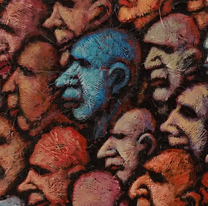
Finished this piece up a week or so back. The final product was never imagined beforehand. It was intended to be a canvas filled with faces but somewhere along the line something changed. Maybe, like the Stephen King words above, it was the uninvited act of a ghostly muse that caused this painting to form.

Who knows?

I do know that when I stepped back feeling that I was done, the whole of it surprised me very much. Mainly because it very much attracted me and raised so many questions, both about what the painting was and where it fit in my body of work.

I could even say it perplexed me. Part of me felt that it wasn’t even my painting, that it belonged to someone else’s mind. It was so unlike my other work that I wondered if this simply a one off event, something that pops up, maybe with the help of some vaporous muse, and never comes around again, or if it was a new direction that had pushed its way into my consciousness.

I can’t say but it sure keeps me looking its way.

It has some size at 24″ high by 30″ wide which gives it even more oomph in the room. I know that in a studio that is filled with new work, it dominates my eye every time I turn its way. There is a confectionary quality to it that passes on a delight of sorts to myself as I look at it. But it also has an ominous feel that makes me wonder where this ship is going and from where it came.

It feels as though there is a lot of mystery here, questions that will never be answered.

It’s been a struggle trying to pin down a title for this piece. I am leaning towards Ghost Ship. Thinking of a boat floating aimlessly on the sea that is empty but for the host of spirits of past travelers that hang on, their stories waiting to be told. Sounds right to me at the moment.

All in all, it pleases and perplexes. I am glad to have it with me for the next few months so that I can better consider its meaning for myself. It might be one of those pieces that is meant only for me.

Who knows?

Read Full Post »

*************************

No matter how individual we humans are, we are a composite of everything we are aware of. We are a mirror of our times.

Louise Berliawsky Nevelson

************************

I am always intrigued by the images I see of the work of Louise Berliawsky Nevelson (1899-1988) who emigrated to the US from Ukraine in the early part of the 20th century. She is best known for her sculpture that is comprised of found objects assembled in large, monumental wall pieces that are often painted in monochromatic tones. There is visual excitement provided by the various shapes of the many bits and pieces contained within the sculptures. They are familiar forms, often dissembled furniture elements, that take on a new meaning in the work.

It makes me want to try to do that sort of thing but the pull is not strong enough to ever get me to actually try. It’s interesting work that makes me try to see a meaning within it that fits my own vision and needs. But I can never quite see a way where it can do what I need it to do for myself. I take that as a sign that it is not my form of expression.

Plus, from a pragmatic standpoint, it looks like it would be a nightmare to dust.

Nevelson’s words above resonate with me. As humans, we are composites of everything we take in. Likewise, artists express this humanness in their work, mirroring their feelings taken from these influences.

I know this is definitely true for myself. I generally can’t help but reflecting my feelings on the world around me. I would think to try to not do so would make one’s work cold and distant. Inhuman.

And that takes us away from the purpose of art as expressions of our humanity.

So, to my artist friends out there, take in all you can and let the world know how you feel it. It’s the human thing to do.

Read Full Post »

It’s fitting that on the day of the annual Academy Awards that this week’s Sunday morning musical selection be taken from a movie, a scene from a film directed by the great Stanley Donen, who died yesterday at the age of 94.

Unless you’re a big fan of films you might not know the name but you most likely know his work. It started back in 1949 with his direction of the musical On the Town with Gene Kelly and Frank Sinatra. He went on to direct some of the greatest musicals of the 1950’s– Seven Brides for Seven Brothers, Funny Face, The Pajama Game, Damn Yankees and Royal Wedding, the film that had Fred Astaire dancing on the walls and ceiling of a room. I note this because Donen  directed Lionel Richie’s Dancing on the Ceiling video 35 years later with many of the same effects.

In a long and interesting career, he also directed non-musical films that I have really enjoyed over the years, films like Indiscreet, The Grass is Greener, Charade, Arabesque and Two For the Road. He even directed one of my favorites, the 1967 cult classic Bedazzled with Dudley Moore as the hapless fool who strikes a deal ( and is constantly baffled by his end of the deal) with the devil played brilliantly by Peter Cook.

But more than any other film, Donen is known for his direction of Singin’ in the Rain from 1952, often called the greatest movie musical of all time. It’s a film I could watch time and time again, always finding something new to focus on- the fantastic dancing, memorable songs, fast paced comedy, and beautiful production with those saturated MGM colors that always excite my artistic senses. I am showing two clips from the film both from a fantasy segment, Broadway Melody, featuring Gene Kelly and Cyd Charisse.

The first, Gotta Dance, has the up and coming Kelly running into and immediately falling for gangster’s moll Cyd Charisse. I love this scene for the rough set design and color employed with the dark reds of the backdrop making Charisse’s brilliant green dress shoot off the screen. That and the sensual dancing between her and Kelly. Just a great scene.

The second is the Broadway Melody Ballet. Kelly after earlier encountering Charisse has gone on to stardom and comes across her and her gangster boyfriend again. It transitions into a dreamlike ballet sequence with a surreal set design that has always fascinated me. It has steps that are camouflaged with colors that appears as soft strips that converge in a vast soft pastel desert. I actually used the concept and color in a few early pieces. Also notable is Charisse’s transition from the hardened moll into a softer dream figure in the sequence.

Take a look if you like. Sadly, you won’t see this kind of thing again but thanks to Mr. Donen and others this great work is still there to be enjoyed.

Have a good Sunday.


Read Full Post »

Casey at the Bat- Sean Kane

The feeling is in the air again and brings back sensory memories. Green grass smell. Bright sun light and brown earth. The vocal patter of the players. The plunk of a ball entering a mitt. The sound of bat on ball, sometimes a dull thunk and sometimes a resounding crack that makes you turn your head to see the flight of the ball.

And the path of that hard hit ball in the air is sometimes a majestic arc that immediately ignites a sense of wonder and a brief glimpse of some innate understanding that evades us at all other times.

Aaah, baseball has returned.

First spring training games start today and to be honest, I am a little more giddy than normal this year. It just feels like we need the game to be bigger and even more transcendent in these times. It needs to be a balm, a healing agent for what ails us. As a longtime symbolic shadow of this country, the game has served that purpose in the past and I have hopes it can do so again.

So, play ball. Please.

I am showing some of the work of Sean Kane, an artist who works painting baseball gloves, especially those beautiful vintage gloves that seem like little more than fat work gloves. If you’ve ever tried to play with one of those, you have greater appreciation for the players of earlier days and what they could do with those gloves.

Anyway, I saw his work and was immediately smitten. Just gorgeous stuff,especially for those of us with a soft spot for the history of the game. One of my favorites is the one from the Cuban player Martin Dihigo who played his career in the Negro Leagues and other leagues in Latin America.

And that Jackie Robinson glove, inside and out, and the Casey at the Bat triptych at the top are both masterpieces! Grand slams!

You can see much more of his work at his site,  Sean Kane Baseball Art, by clicking here.

Play ball!

Sean Kane- Martin Dihigo Glove

Sean Kane- Jackie Robinson Glove Outside View

Sean Kane- Jackie Robinson Glove Inside View

Sean Kane- “Say Hey” Willie Mays Glove

Sean Kane- Babe Ruth Glove

Sean Kane- Shoeless Joe Jackson Glove

Read Full Post »

A Little Frida

*******************

Nothing is absolute. Everything changes, everything moves, everything revolves, everything flies and goes away.

–Frida Kahlo
*******************
.
I have been wanting to feature Frida Kahlo (1907-1954) for some time now. Her work is a unique and deeply personal voice in the world of art, one that touches on her identity as a Mexican, as a woman and as a political being. Her body of work might well be the the most overtly biographical collection done by an artist. Her famed self portraits make up about a third of her output.
.
I have no doubt that most of you have seen her work and are somewhat aware of her story. She has become an icon in modern art, the story of her all too brief life– the debilitating pain she suffered from childhood polio and a later accident, the turbulent and loving marriage to the painter Diego Rivera, her political beliefs, her affairs and much of her personal life– captured in books and film.
.
So, I am not going to spend a lot of time on that. Instead, let’s just take a look at a few of her paintings. As I said, they are unique and deeply personal but there is something in them that appeals to aspects in many of us. There is also a short film with more of her paintings set to a song about her.
.

*************


*************

Read Full Post »

Want to keep it short this morning as I want to get right to work on a piece that is on the easel. And that desire to go right to the brushes is a good thing, an indicator that a groove is coming.

So, for this Sunday morning here are a couple of noir-ish photos to accompany one of  my favorite songs, Stolen Car, from the 1980 album ,The River, from Bruce Springsteen. The mood of this song, especially within its organ and piano lines, always moves me.

Good painting music.

Have a good Sunday…

Read Full Post »

There is an exhibit currently hanging at the Rockwell Museum in Corning of photos from photographer Yousuf Karsh, who had an incredible ability to capture the essence of his subjects. Many of his shots of the celebrated figures of the 20th century are the best known images of those folks. I saw an exhibit of his work years ago and was really inspired by it. It played directly into a piece from my Exiles series at the time that I wrote about here back in 2008 that I am sharing again below.

The Karsh exhibit at the Rockwell Museum in Corning hangs until May 5.

*****************

Blue GuitarThis is another of the paintings from the Exiles series, a piece titled Exiles: Blue Guitar. This was larger than the other paintings in the series and was the most intricate in design. It was the only piece to show a full body, more or less. The crimson sheets beneath the figure are certainly not typical of my work. Even the blue guitar was an anomaly. I think these things, in themselves, make this a distinctive painting and one that is perhaps the one piece I most regret letting go.

I remember painting this piece back in ’96 with great clarity. The face was based on a portrait of the Finnish composer Sibelius taken by Karshthe famed photographer. I had seen the photo at a wonderful and powerful exhibit of Karsh portraits at the MFA in Boston that knocked me out. Karsh had a knack for revealing the essence of his subjects in a single image.

I was immediately taken with the image of Sibelius’ face. It expressed bliss, but not joy. A painful bliss, perhaps an ecstasy tempered by the knowledge that the world is an imperfect one and that this moment of grace is a fleeting one, soon to be gone. It was exactly the expression I saw for my guitarist and one that I wanted the whole piece to convey.

This painting was the centerpiece of my first exhibit many years ago and remains vividly in my memory. Eventually, I went back in and darkened the background which made the guitarist pop even more. But the images of that change have been lost over the years which I greatly regret. This piece sold years ago and I now have no idea of where this painting ended up. I hope that whoever possesses this piece appreciates all that it represents and gives this sad, blissful guitarist a bit of attention now and then.

*****************

Note: The opening for the for the 25th Anniversary exhibit at the Principle Gallery is next Friday, February 22. I mistakenly wrote here the other day that it was tonight because, well, I get confused and make mistakes sometimes. My apologies for any confusion. Hope you can make it to the show next week!

Read Full Post »

There is an opening next Friday, February 22, [I originally said the opening was on the 15th because, well, sometimes I get confused]of a special exhibition at the Principle Gallery that marks 25 years of providing high quality artwork in historic Alexandria, Virginia. It has been my great pleasure and honor to be part of this great gallery for 23 of those years and I am pleased to have several pieces in this special show.

Like many of the artists it represents, the Principle Gallery has grown and evolved over those 25 years, becoming one of the most prominent galleries in the country with artists and collectors from near and far as well as another gallery branch in Charleston, SC.

But even with its growing influence in the gallery world, its strength remains the personal and warm welcome it offers to anybody who wanders through the doors of its location in the historic Gilpin House at 208 King Street. There is never a sense of pretense or condescension and the entire staff does all it can to make all feel comfortable. It is all about allowing the gallery visitor to experience the artwork in a way that allows them to relax and fully absorb the art in a personal fashion.

And they have done that successfully every day for the past twenty five years. And I sincerely thank and applaud hem for that. I hope that if you’re in the area you can stop in to celebrate the occasion with them on Friday evening, February 22. The opening reception begins at 6:30.

Unfortunately, I can’t make this opening. But I will be there in June for the opening of my 20th annual solo show. Hope to see you then!


Read Full Post »

I came across an interesting short video from the Frick Museum with details about one of my favorite paintings, a portrait of Sir Thomas More done by Han Holbein. I thought I would show it along with a repost of a blog entry from back in 2009. Take a look.

You run across a lot of people who are completely dismissive of anything from the past. They feel that we at the moment are the leading edge of humanity’s progress, that we are the culmination of all that has come before us and thus, anything created long before our time can not have equal value  now. There’s this sense that only the modern can fully express the complexity of our world.

When I see this painting of Sir Thomas More painted by Hans Holbein the Younger in around 1527 I realize what flawed logic that is.

Here is a painting that was painted nearly 500 years ago that, when seen in person at the Frick in NYC, has surfaces that are absolutely beautiful. It still glows with its sumptuous colors. All the years of technical progress have not produced materials that could accomplish any more than Holbein did with the materials of his time.

holbein_henryviiiI could stand and look at this piece for hours, marveling not only at the beauty of the paint but at the way Holbein captured More’s humanity and the sense of the time in which it was painted. For me, this painting really illustrates, gives life to, an important figure in history. More was the ultimate man of conscience, refusing to give in to Henry VIII‘s will that he endorse Henry’s divorce from Catherine of Aragon so that he might marry Anne Boleyn. It ultimately cost him his head and cost the world a wonderful mind, one that gave us the concept of Utopia.

It is obvious to me that Holbein felt warmly towards More in the way the piece is painted and the way he captures his persona. In the painting Holbein  did of Henry VIII (on the left) I get a different sense. It’s meant to be large and strong, to be a display of regal power and that it is. But there’s a coldness in the piggish eyes and an arrogance in the stance. Oh, it’s a beautiful painting, on many levels, but when you compare the two it’s obvious where Holbein’s sympathies lay.

This is art and history coming together at single points. It captures the humanity that is contained in all of us and remains unchanged even to the edge of our time. Good stuff. No, great stuff…

Read Full Post »

This Sunday morning’s musical selection is tied somewhat to a group of new work that has been rekindling my fire here in the studio. I’ve shown a couple of images of new paintings here and on social media of what I might call my Mask pieces.

Each has been a group of faces that is done in quick strokes from a single brush, starting from one point and filling the canvas. It is unplanned in almost every way. No color plan. No theme. Just intuitively and roughly formed faces that stem from a lifelong collection of faces that have been stacked in my head, culled from looking intently at clouds, woodgrains and patterns of all sorts through the many decades. Seeing them spill out in this way has been energizing in a way that I know from experience will spill over into the rest of my work even if this particular work remains for me privately.

I haven’t been thrilled with how the camera is catching the images thus far. They have been quick photos that don’t fully capture much of the subtlety in the closer parts of the painting. So when the musical selection came up this morning, this section of one of the paintings jumped out at me. I thought showing it in detail would better show how I am seeing the work.

The song selection is the jazz standard Born to Be Blue, written by Mel Torme in 1946. It’s been performed by scores of singers over the years but it became a signature piece for the late Chet Baker.which is the version I am sharing below. In fact, a 2015 film biography of his life starring Ethan Hawke as Baker uses the song title as the film’s title. This version highlights his vocals rather than his horn work and features great piano playing from Bobby Scott.

Hearing it made me think of a blue face that I consider a central character in one of these pieces. At least my eye always lands on him first before roaming across the rest of the picture. The image at the top is a detail featuring him and shows better some of the surface and textures that compose the painting.

That being said, I am eager to get back to work on a new piece in this same style. Enjoy the song and have a great Sunday.

Read Full Post »

« Newer Posts - Older Posts »