Feeds:
Posts
Comments

Archive for the ‘Influences’ Category

166_1934_CCI find it hard to believe that I haven’t mentioned the work of Charles Sheeler here, outside of a mention of his collaboration with Paul Strand on the film Manhatta, a landmark American art film from 1921.  Sheeler (1883-1965)  is one of my favorite artists who as  a pioneer in photography and painting in the early decades of the 20th century is often called the father of Modernism.  Oddly enough, I am particularly drawn to his industrial imagery which replaces almost all evidence of things natural in completely man-made factoryscapes.  This  might seem to be the antithesis of my own work,  which often omits all evidence of human intervention in my landscapes.

Charles Sheeler River Rouge PlantSome of his most potent work came from an assignment where Henry Ford hired Sheeler to photograph his factories, wanting him to glorify them in an almost religious manner, as though they were cathedrals for the new age.  As Ford had said at the time, “The man who builds a factory builds a temple. The man who works there, worships there.”  Sheeler was impressed with the factory complexes and felt that, indeed, they represented a modern form of religious expression.  His painted work from this time glorified the machine of industry in glowing forms and color.

Charles Sheeler Shaker Barn
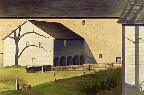
He saw the factory as a continuation of the American idea of work as religion, one that was rooted in the sense of  reverence and importance of the barns and structures of the farms of the earlier pre-industrial age.  He   painted many scenes of farms and barns, abstracting the forms as he had with the factory scenes.

Charles Sheeler Classic Landscape
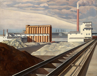
I don’t know that I completely agree with Sheeler on his idea of the factory as cathedral but I do have to admit to being awestruck in the presence of large factory structures.  I remember working in the old A&P factory, a huge building that was said to have the capability to produce enough product each day to feed everyone east of the Mississippi.  It no longer exists.  Some of the huge rooms in the building were amazing to stand in, as the machines hummed and throbbed while workers hustled about servicing their needs.  I particularly remember the tea room which was a huge ca cavernous space with row after row of steampunk  looking machines that bagged the tea then sewed it shut.  I cleaned these machines for several weeks and, standing in the grand space in silence after most of the workers had gone and the machines turned off, felt that feeling of awe.   I would sometime walk around from area to area, just taking it in.  I didn’t necessarily adore it in the manner of a religious zealot but there was no denying the  power in its magnitude and the power of the machine.

Maybe that’s why I’m drawn to Sheeler.  Maybe its his use of form and color.  I don’t know.  I guess it doesn’t really matter.  I just like his work. Period.

Charles Sheeler Conversation Sky and Earth

Read Full Post »

“Not I, nor anyone else can travel that road for you,
You must travel it for yourself.

It is not far, It is within reach,
Perhaps you have been on it since you were born, and did not know,
Perhaps it is every where on water and land.”

–Walt Whitman- Part of Song of Myself from Leaves of Grass. 1855

Walt Whitman-  Thomas Eakins 1891

I’m in a bit of a hurry but really wanted to show this great photo of Walt Whitman.  I don’t think I’ve ever seen a photo of him that wasn’t interesting but this one is special.  It’s taken by the great American painter Thomas Eakins in 1891, a year before Whitman’s death in 1892.  Eakins was also a pioneer in the use of photography in the art studio and an innovator in motion studies with film, among many other things.  I plan on writing more about his remarkable career in the future.  But for now, I just wanted to show this simple elegant photo of America’s voice.  At least to my ears.

Read Full Post »

Cameron_Julia_Margaret_Iago_Study_from_an_ItalianA few months ago, I posted one of my favorite photos, Sadness, from the  British Victorian era photographer Julia Margaret Cameron.  I was struck by the contemporary feel and presence of the photo taken of the actress Ellen Terry in 1864.  It had a naturalness that was unlike much of the photography that we think of from that era, making me feel that it could be a photo from any time.

I recently came across another of Cameron’s photos that hit me in very much the same way.  It is an 1867 study of a young Italian man,  Angelo Colarossi, portraying Iago, the betrayer of Shakespeare’s Othello.  With downcast eyes, his unshaven face fills the frame and you don’t see any props to give away his character.  It may be betrayal that fills his face but for me it is more along the lines of Judas than Iago.  There seems to be remorse and even a bit of Christlike genuflection in his downward gaze.

Like Cameron’s Sadness, this piece has a freshness that makes it feel out of time.   It is a document of emotion that crosses time.  Cameron had a real knack for capturing the universal and eternal in her work, when all others were capturing stiff, glassy-eyed portraits in her own time.  For me, I use Cameron’s work as reminder of the quality that I want in my own work, that universal and timeless appeal, even though our methods and materials and eras are so different.

Just a great photo.

Read Full Post »

Work Ethic/Redux

997-341-labor-to-light-4001 I’ve been going over some old blogposts from back in late 2008/early 2009 in preparation for a couple of upcoming interviews on public radio and television, just to see how my views on my work, or at least how I represent them,  might have evolved over the last four years.  I came across this post from October of 2008 that talks a bit about how  my work ethic in the studio was shaped.  It’s one of my favorite posts from that time and a story I’ve related a number of times over the years ,  one that I think is still relevant for most field of endeavor.

This is a piece called “Labor to Light”, a smaller piece that is at the West End Gallery in Corning.  It features one of what I call my icons, the field rows running back to the horizon.  To me, they represent the act of labor and its fruits- the work ethic which has been very important to me in this career and something I stress to kids whenever I get to talk to them.  

I remember years ago reading an interview with author John Irving (of “Garp” fame) where he talked about his work routine.  He talks quite a bit about wrestling in his writing as he was a high school and college grappler and he used a wrestling analogy to describe how he approached his writing.  He said that if he wanted to go to the highest level as a wrestler, which would be an Olympic or world  champion, he would have to train harder and longer than the men he would be competing against.  He felt that he was basically competing against every wrestler in the world.  He then turned this to writing.  

He turned his writing into a competitive effort of Olympic proportion, where he was competing with every other writer in the world for each reader that came into a bookstore.  If you were buying someone else’s book, you weren’t buying his and in his mind, he had lost.  So he began to train himself as a writer with the same effort as though he were an Olympic athlete, writing 7-8 hours per day, forcing himself to forge ahead even on days when it would be easy to just blow it off and do anything else.

When I read this it struck a chord.  I realized that in order to reach my highest level I would have to be willing to devote myself to working harder and longer than other artists, be willing to spend more time alone, away from distraction.  It would require sacrifice and hard labor.  But Irving’s example gave me a path to follow, a starting point.

I have since realized that there is a multitude of talented people out there, many with abilities far beyond mine.  But to communicate successfully with one’s art one needs to push that ability fully, in order to go beyond what your mind sees as an endpoint. I see this as my goal everyday in the studio.  Sometimes I succeed and sometimes I come up short but I’m out there competing everyday.

Thanks, John Irving

Read Full Post »

Howard Pyle-  Marooned PirateLater this year, the Fenimore Art Museum will be presenting a big show featuring the works of the first family of American art, the Wyeths, in a show titled  The Wyeths: A Family Legacy.  I have written several times here about my admiration for the work of  family patriarch NC Wyeth and son, Andrew Wyeth.  Their work is woven into the cloth of American art and this should be a great exhibit highlighting their work as well as other talented members of the clan.  Also included in this show will be work  by the great American illustrator, Howard Pyle, who was the teacher and mentor to NC.

Howard PyleAlthough his name is not nearly as well known as many who followed in his footsteps, it’s hard to overstate the influence that Pyle (1853-1911)  had on future generations of American illustrators and artists.  He was huge in his time, a celebrity who mingled with the great writers and thinkers of the time.  His illustrations for many of the most popular magazines of that time, based on the great stories of literature, shaped how we saw those stories.  Cinematographers, costumers and set designers took their clues from Pyle’s visions of the stories they were staging.  For example, his vision of Robin Hood became the idealized version that we came to know in the old Errol Flynn classic movie.  His idea of the pirates of Treasure Island became ours.  His cowboys, knights  and explorers ingrained themselves into our collective psyche as we saw them on the page and on the movie screen.

Howard-Pyle-The-Wolf-and-Doctor-Wilkinson-Once-it-Chased-Doctor-Wilkinson-into-the-Very-Town-ItselfThere is an interesting sidebar to the extent of Pyle’s fame.  In a letter to his brother, Theo, Vincent Van Gogh wrote ” Do you know an American magazine Harpers Monthly?  There are wonderful sketches in it…which struck me dumb with admiration…by Howard Pyle”  His work may have been illustration but it was  pure art as well and the eye of Van Gogh could see that in the  line work and rhythm of his compositions.   I know that I am always inspired by his work and the that of his acolytes,  including NC Wyeth and Norman Rockwell.   I am  really looking forward to seeing his work alongside the Wyeths this year at the Fenimore.  It should be a memorable show.


Read Full Post »

Morris Hirshfield TigerThere are so many artists out there, both now and from the past,  that I’m not surprised when I come across an artist with which I am not familiar whose work knocks  me out.  But sometimes I come across work that is so strong and consistent in its vision that I just can’t understand why the name is not known to me.  That’ happened recently when I was browsing through a book on the collection of the American Folk Art Museum and came across the name Morris Hirshfield.  The name didn’t ring a bell but the work was so wonderful.   It had a naive feel in the rendering of the figures but there was a sophistication in the composition and coloring that made me feel that it was anything but folk.

I definitely had to find out more about Morris Hirshfield.

Morris Hirshfield Angora CatBut there’s little to learn about the man.   Not a lot is written, only a few mentions in books. That surprised me.  But his story is pretty simple.

He was born in Poland in 1872 and came to America around 1890 at the age of 18.  Like many many of the Jewish immigrants of that time who settled in the New York area he began working in the garment industry.  With his brother, he opened a coat factory that evolved into a slipper factory which was very successful.  Morris  encountered health problems and retired in 1935, at which point he took up painting, following up on an artistic urge he had as a child but had put aside long ago.

Morris Hirshfield Girl With PigeonsWithin four short years, his work had attracted the attention of collector and art dealer Sidney Janis, who used two of Hirshfield’s paintings for an exhibit he was putting together in 1939 for the Museum of Modern Art, Contemporary Unknown American Painters.  MoMA , at that time, was committed to collecting and showing the work of self-taught artists.  In 1941, MoMA purchased two of Hirshfield’s paintings for its collection and in 1943 gave  Hirshfield a solo show.  He had only painted 30 pieces up to that point in his career.   There was great controversy over the show at the time as the critics of the era savaged it.  It was, according to Janis’s biographer,  “one of the most hated shows the Museum of Modern Art ever put on.”  It led to the dismissal of the museum director at the time.

Morris Hirshfield Dogs and PupsBut Hirshfield survived and painted his paintings of animals and the occasional figure for a few more years until his death in 1946.  His career spanned a mere 9 years over which he produced only 77 paintings.

I don’t really understand the controversy of the time or why Hirshfield hasn’t inspired more  writers or artists.  Or maybe he has and I just can’t find  much evidence of it. When I clicked on the Google image page for him, I was immediately smitten.  There was that sense of rightness that I often speak of here.  Just plain good stuff.  Just wish Morris Hirshfield had been around longer so there might be more to see.

Morris Hirshfield Beach GirlMorris Hirshfield Baby Elephant With Boy 1943Morris Hirshfield Lion 1939Morris Hirshfield Zebras


Read Full Post »

GC Myers- The ClearingThis new piece,  a 16″ by 16″ image on paper,  has been a long time in the making.  I started it when we got back from California at the beginning of December and have went at it in dribs and drabs over the last several weeks, finally putting on what I feel are the last touches yesterday.  It’s an odd piece for me, darker in theme and feel, but one that makes me want to continue looking at it.

The idea came from the trip, from someone I met at the Just Looking Gallery.  He has some of my work and told me that he had an idea for what he thought would make an interesting painting for me.  I usually don’t get much inner response to those type of solicitations but I immediately had an image in mind as he described a simple clearing where a path comes to an end.  It was  an intriguing concept that was a new variation on the path that often winds through my paintings .

Does that path ever come to an end?   What if it did end?  How would that place look and feel?  All of these thoughts ran through my mind in a flash.  It was such an existential question with great symbolic potential.  The idea and the image ran through my mind for the rest of the trip.

This is the first incarnation of that thought.  I used the Red Chair as the central character here.  I felt that there needed to be a character of some sort in this space and didn’t want it to be a figure.  The chair also creates a new set of questions.  Why was it there?  Who put it there and who sits in it?  As the path in this piece comes to its conclusion , the wider clearing at its end gives it the appearance of an old keyhole.  Perhaps this is a symbol for the unlocking of some barrier behind which lay the answers to our greatest questions or  to some grand mystery?

It’s a piece that keeps asking questions and I don’t know if it will ever yield answers.  But it makes me want to keep looking. and perhaps that is its purpose here.

I don’t know– it’s a mystery to me as well.

Read Full Post »

Richard lindner Double PortraitI’ve been going through some books on my shelves that I haven’t looked at for some time and came across a smallish book on the work of Richard Lindner, who was  a German born  (1901)  painter who moved to New York during World War II.  He taught at the Pratt Institute then later at Yale before his death in 1978.

His work was obviously a big influence on the Pop Art movement of the 60’s.  If you remember the artwork for the Beatles’ Yellow Submarine film,  you can easily see how Lindner’s work Richard Lindner The Coupleguided the hand of the film’s  artist who most people think was Peter Max.  However, the artist was Heinz Edelman .  This misconception probably shows Lindner’s influence on Max as well.   I also can see Lindner in some of Terry Gilliam‘s animations for Monty Python.  The Beatles  paid tribute to Lindner  by inserting his image  in the group of figures on the cover of their classic Sgt. Pepper’s Lonely Hearts Club Band album.  He’s  between Laurel and Hardy in the second row.

I am really attracted to Lindner’s colors and use of forms.  His colors have gradations and complexities that give his work added dimension.  His shapes and lines are strong and sure.  It’ demands an immediate response, even if it’s negative, and I really respect that.

Richard Lindner  FBI On East 69th StreetOne of my favorites is shown to the left here,  FBI On East 69th Street.  I have no idea whether he was influenced by Lindner’s work (although I wouldn’t be surprised), but when I look at this painting I can only think of  David Bowie, especially in the early 70’s in the Glam era.  Again, the strength of the color and shape,s as well as how his figures fill the picture frame, excite me.  How I might take this excitement and make it work within my own work is something that remains to be seen.  It may not be discernible but seeing work that makes your own internal wheels spin will show up in some manner.  We’ll have to see if this comes through in the near future.

Richard Lindner The Meeting

Richard Lindner Rock-RockRichard Lindner Telephone

Read Full Post »

Yesterday, I pulled  a book off the shelf about the work of the great illustrator/painter Maxfield Parrish.  I’ve always been drawn to his work and feel that it’s been a definite influence on my own.  I had someone who had seen my show at the Fenimore Art Museum say that he was attracted to my work because they were the paintings he wanted to paint.  Looking at the work of Maxfield Parrish, I think I understand what he means.  Below is a reposting of a blog entry from January of 2009 that I think really summarizes what I see in his work and how I have incorporated some of these things into my own.

**************************************

parrish-christmas-morning-1949Today I want to just show the influence of Maxfield Parrish on my work. He is certainly well known for his fairy tale-like scenes of scantily-clad young women or children in fantastical settings but I have always loved his other, lesser known work, particularly his landscapes and homescapes. 

There’s an intensity and warmth of color that I find completely compelling, drawing you in immediately and immersing you in a luxurious blanket of warm tones. For instance, in the piece above, Christmas Morning 1949, even though it is a wintry, snowy scene there are warm tones in the snow fields. It changes how you look at and feel about the scene, differentiating it from the normal, obvious winter landscape. 

parrish-hunt-farm1I am also visually excited by the way Parrish used gradience in the colors of his skies, taking a deep rich color at top and drawing it down in lighter fragments of the colors that make up the original color. It creates a brilliant effect. 

The trees often took a central part in his compositions as well, something to which I was obviously attracted. Many were boldly colored and powerful. 

The houses were mainly long range and very idyllic, warm interpretations. More home than house. There was never a specific story conveyed in these homes, just an overall feeling that was formed by their part in the overall picture. parrish-hill-top-farm-winter

I have also been influenced by the way Parrish put his compositions together, how all the elements were placed to create mood. The way the trees fill the picture plane. The way the houses are shown, never in full view. More about feeling and inference rather than representation. 

I could go on and on about his work and all the little things comprising his magic that I’ve tried to incorporate into my own work but the images tell the story much better. Enjoy…

parrishevening-shadows1parrish-the-reservoir-at-villa-falconieri-frascati1

Read Full Post »

Eyvind Earle Three OaksI just wanted to share a few more tidbits from the recent foray out west.   The image shown here is from the late artist Eyvind Earle, who I have mentioned here a couple of times before.  I have quite an attraction to his graphic style and as we finally emerged on our drive westward  from the wide agricultural  central valley  I began to see how the landscape of the coastal hills of California inspired his work.  Golden hills with perfectly crowned oaks placed sporadically upon them were in abundance.  It was hard not to see paintings coming to life as I drove through the hills.

Just before these hills, as we crossed on Rte 46, we came across the James Dean Memorial Junction near Cholame, the site where Dean crashed and died in his Porsche Spyder back in 1955.  It’s a sparsely populated area with little of note anywhere in sight  and it seems like a strange and desolate place for such an iconic figure to have met his end.  Not being a big  James Dean fan, I wasn’t aware of the place beforehand but found the space fitting in an odd sort of way.

But though there are several other things I could recount here, the one I most want to mention is about meeting Mike and Lilia at the opening .  They are from a few hours north of San Luis Obispo and Mike is a police officer in Salinas, a city with a very high violent crime rate.  Mike has formed a connection with my work that really touched me, making me feel as though there was a value in it that I had never seen.  Mike sees a lot of terrible things in his job.  A lot of violence.  A lot of carnage, a lot of  flowing blood.  He has a strong sense of association with colors and it had gotten to the point that the color red was so associated with blood and injury that it bothered him immensely when he came across the color anywhere.

But Lilia and Mike had come across my red trees a while back and the image and the harmony in it helped Mike disassociate the color red from the violence it had come to represent for him.  He found great peace in the work and used it to soothe him after his shifts.  It was a much better choice  for both him and his family than turning to the bottle, as he pointed out to me during the show.

That painting, the first they had ever bought, had also inspired a greater interest in art.  Mike is now drawing and going to local artists’ studios near their home, eager to explore more and more forms.  It was wonderful to hear him tell his story.  You could see how art had  affected his life on a deeply emotional level and simply made it better.  You could definitely see it on Lilia’s face as she listened to Mike tell the story.  If no one else had shown up at that show that night, just hearing Mike’s testimonial to the power of art would have made the whole trip worthwhile.

I really wanted to mention Mike’s story.  It makes my work here in the studio feel much less solitary, as though the eyes of Mike and Lilia are present.  I consider that my gift from California.


Read Full Post »

« Newer Posts - Older Posts »